6 Best Data Visualization Tools Infographics For SaaS Founders
Discover the best data visualization tools infographics to turn complex SaaS data into high-converting social media carousels. Scale your B2B brand today.
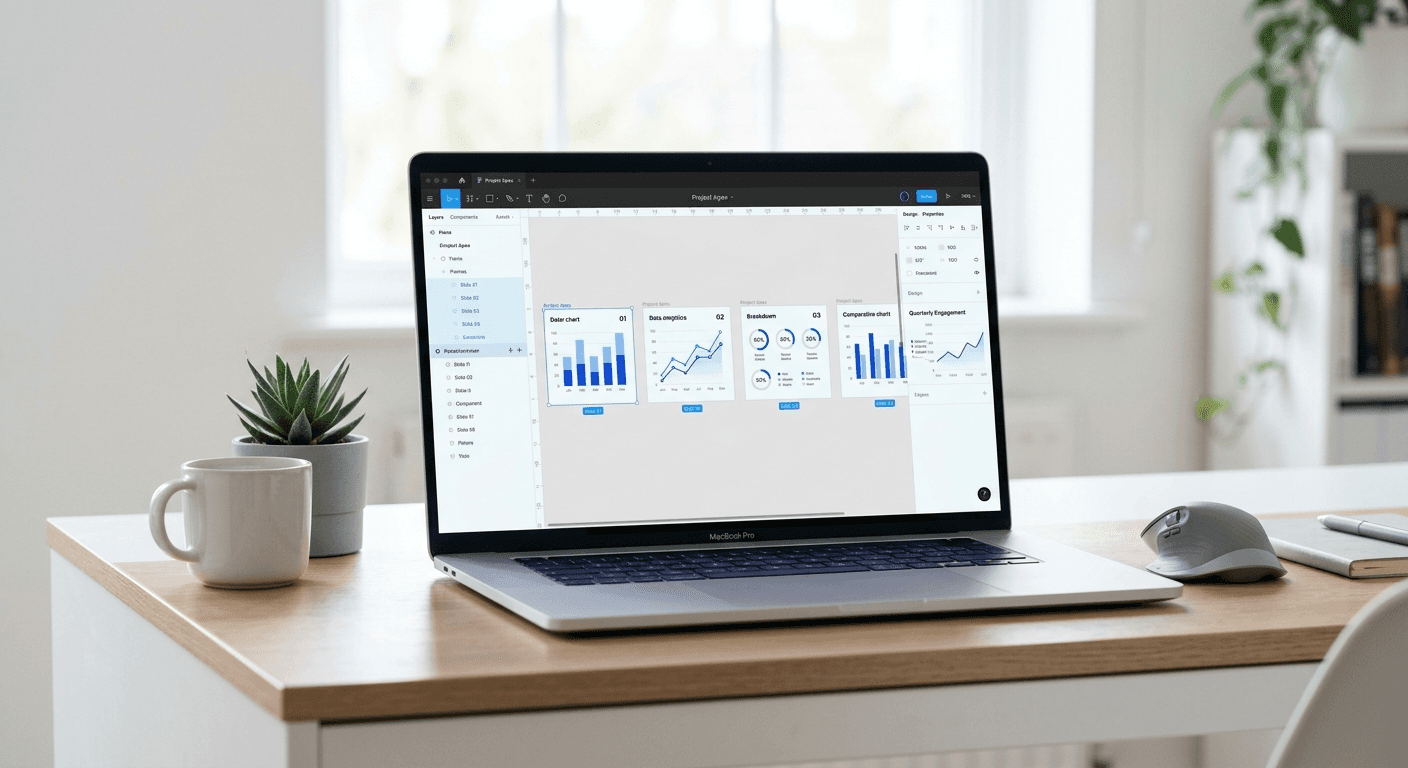
The best data visualization tools infographics are platforms that convert raw numbers into brand-aligned assets for LinkedIn and Instagram. We prioritize tools that offer direct Figma integration to help founders and marketers ship professional content without hiring expensive designers. These tools solve the problem of dense spreadsheets by creating visual narratives that drive engagement and lead generation.
Why is visual data storytelling b2b critical for growth?
Visual data storytelling b2b is a strategy that transforms abstract metrics into persuasive visual evidence to build trust with sophisticated buyers. In a market where attention is scarce, presenting a case study or a market trend as a chart is more effective than writing a long-form article. We see creators who use visual data gain authority faster because they provide immediate proof of their claims.
B2B buyers consume an average of 13 pieces of content before making a purchase decision according to Forrester research. Data-heavy content like whitepapers and case studies often fails because it is too dense for social consumption. Visual data storytelling b2b solves this by turning metrics into digestible insights. When we share a data point on LinkedIn as a chart, the focus shifts from the raw number to the trend it represents. A study by the Social Science Research Network found that 65% of people are visual learners, meaning they process information better when it is presented graphically rather than in text. For SaaS companies, this means your customer acquisition cost (CAC) or churn reduction data needs a visual home. High-quality charts build authority and shorten the sales cycle by proving value through clear, evidence-based graphics that stakeholders can understand at a glance.
Founders often struggle to find the middle ground between a boring Excel chart and a custom illustration. Using the right tool allows you to maintain professional standards while moving at the speed of a startup. You need to present data that looks like it came from a premium design agency, even if you produced it in five minutes during a coffee break.
Which top chart makers for saas marketing 2026 offer the best ROI?
The top chart makers for saas marketing 2026 are those that prioritize speed, brand consistency, and export quality for social media platforms. We look for tools that allow for CSV uploads and offer pre-set color palettes that match your existing brand identity. Investing in a dedicated tool is more cost-effective than paying a freelancer a monthly retainer for basic marketing assets.
High-growth companies use specialized software to make marketing graphs because these tools provide features that generic office suites lack. For example, many modern platforms now include automated animations and responsive layouts that adjust for mobile screens. According to data from Socialinsider, LinkedIn carousels that include data visualizations generate 1.92% higher engagement than those with static images alone. This increase in reach translates directly to lower lead acquisition costs. When you use one of the top chart makers for saas marketing 2026, you ensure that your data is not just accurate, but also aesthetically aligned with your premium product positioning. The return on investment comes from the time saved in the revision process. Instead of back-and-forth emails with a designer, you can update a data point and re-export the graphic in seconds. This agility is what separates market leaders from those who struggle to keep their social feeds active.
We recommend starting with tools that focus on the "final mile" of content creation. It is not enough to just make a chart. You need to make a chart that fits into a 1080x1350 pixel frame and looks sharp on a mobile device. The best tools understand this constraint and offer templates specifically for LinkedIn and Instagram creators.
Tool Name | Key Feature | Best For |
|---|---|---|
Figma (Plugins) | Vector-perfect exports | High-end custom carousels |
Flourish | Interactive storytelling | Complex data narratives |
Datawrapper | Clean, journalistic style | Case studies and whitepapers |
Rows | Live data connections | Automated performance updates |
Graphy | Modern, colorful presets | Quick social media posts |
Napkin | AI-assisted layout | Indie hackers and creators |
How do best figma infographic plugins simplify your design workflow?
The best figma infographic plugins are specialized add-ons that allow you to generate charts directly inside your design workspace without leaving the app. Plugins like "Chart" and "Dataviz" connect your layers to live JSON or CSV data, enabling instant updates to complex visuals. We find that this integrated approach is the fastest way to build beautiful data design b2b content.
Figma is the industry standard for UI/UX design, and its extension library is unmatched for marketing teams. Using the best figma infographic plugins means you can maintain a single source of truth for your brand styles while importing raw data. For instance, the "Chart" plugin supports 18 different chart types and can sync with Google Sheets. This is vital for SaaS founders who need to report on monthly recurring revenue (MRR) or user growth regularly. By staying within Figma, you eliminate the need to download PNGs from other software and re-upload them. This reduces the risk of blurry images or mismatched font sizes. In our experience, using a plugin-based workflow reduces the time spent on a single infographic slide from 30 minutes to under five. You simply select a frame, run the plugin, and your data is rendered as editable vector shapes. This allows you to apply your brand colors and typography instantly using global styles, ensuring your data looks like a native part of your website or social media presence.
Startups need to ship content daily. If your workflow involves jumping between three different tools to produce one carousel, you will eventually stop posting. We advocate for a Figma-first strategy because it centralizes your creative assets. When you use professional Figma templates, you can drop your plugin-generated charts into a pre-made layout for a finished product that looks world-class.
Why should founders use software to make marketing graphs instead of manual drawing?
Software to make marketing graphs is a category of tools designed to automate the geometry of data visualization. These applications handle the math of scaling bar heights and pie slices so you can focus on the message. We suggest avoiding manual drawing in Figma or Illustrator because it is prone to errors and impossible to scale across multiple projects.
Manual design is a significant bottleneck for growing companies. If you try to draw a line chart by hand, any change in the data requires you to move every point individually. Software to make marketing graphs automates this by using coordinate-based rendering. Research from Demand Gen Report indicates that infographics can increase website traffic by up to 12%. However, that traffic only comes if the content is published consistently. Manual processes kill consistency. By using a tool like Datawrapper or Flourish, you create a repeatable system. You can build a template once, and then simply swap out the CSV file for every new campaign. This systemic approach is essential for B2B companies that rely on data-heavy lead magnets. It also ensures accuracy, which is the foundation of brand credibility. If a chart is slightly off-scale due to a manual drawing error, sophisticated buyers will notice and question your data. Professional software removes this risk and provides a polished finish that signal-boosts your expertise.
Modern founders act as their own marketing departments in the early stages. You do not have time to learn the intricacies of vector manipulation. You need a tool that lets you paste a row from a spreadsheet and gives you a beautiful chart in return. This is the only way to maintain a high-quality content output while building your product.
How do you maintain beautiful data design b2b across different channels?
Beautiful data design b2b is the practice of applying consistent brand guidelines to all visual metrics to create a cohesive user experience. It involves using a limited color palette, clean sans-serif typography, and generous whitespace to ensure the data is the hero. We believe that your charts should look like they belong to your product UI, not like an afterthought from a generic generator.
To achieve beautiful data design b2b, you must define your design tokens before you start building charts. This includes your primary brand colors, a set of complementary colors for chart series, and specific font weights for headers and labels. According to a study on Social Science Research Network, color increases brand recognition by up to 80%. If your LinkedIn charts use different colors than your website, you are losing brand equity with every post. We recommend creating a "Data Styles" page in your Figma design system. This page should house the hex codes for your charts and the specific stroke widths for your axes. When you use tools like Rows or Graphy, you can often save these themes as defaults. This ensures that every member of your team, from the CEO to the intern, produces graphics that are visually aligned. Beautiful design is not about decoration; it is about clarity and professional standards. A clean, minimalist chart tells the viewer that you are a modern, organized company that pays attention to detail. This perception is invaluable when you are competing for high-value B2B contracts.
Whitespace is your most powerful tool in data design. Do not crowd the chart with unnecessary gridlines or labels. Use a large, bold title to state the takeaway of the chart immediately. If the viewer has to spend more than three seconds figuring out what the data means, the design has failed. Keep it simple and focused on a single insight.
A well-designed chart does more than show data; it makes an argument. In the B2B world, whoever has the clearest argument wins the market.
What are the best data visualization tools infographics for fast-moving startups?
The best data visualization tools infographics for startups are those that offer a balance between customization and speed. We recommend a stack that includes Rows for data management, Flourish for complex visuals, and Figma for final assembly. This combination allows you to handle everything from simple bar charts to interactive maps without a steep learning curve.
Rows is a modern spreadsheet tool that excels at being a data source. It allows you to pull data from your SaaS tools like Stripe or Google Analytics and turn it into clean charts instantly. Flourish is excellent for when you need a more "storytelling" feel, such as an animated racing bar chart. For social media, the final output is usually a carousel. This is where you bring everything into Figma. By using the best data visualization tools infographics, you build a content engine that produces high-value assets with minimal friction. Startups that win in 2026 are those that can take a trend, back it up with data, and turn it into a viral visual within an hour. This speed is only possible if you stop treating design as a manual craft and start treating it as a component-based system. We use these tools because they respect our time and allow us to focus on the core product while still looking like a premium brand. Your visual identity is often the first thing a potential customer sees. Make sure it reflects the quality of the software you are building.
Success in B2B marketing is about building a library of assets that can be repurposed across LinkedIn, X, and your blog. When you create a chart in a tool that supports high-resolution exports, you are creating a reusable building block for your brand. Stop wrestling with basic tools and upgrade to a professional dataviz stack today.
We see the best results when founders treat their social media content with the same design rigor as their product. The best data visualization tools infographics make this standard attainable for everyone. By combining these tools with a structured design system, you can produce content that stands out in a crowded feed and drives real business growth.


