8 Best Grid Systems Social Media Templates Use for High Engagement
Discover the best grid systems social media templates use to increase reach. Apply these 8 Figma layout structures to create professional, viral posts in minutes.
A grid system is a mathematical framework that organizes visual elements into a predictable, readable structure. The best grid systems social media templates rely on specific column counts and margins to ensure content remains legible and professional across mobile devices. Using these layouts helps you produce high-quality content without the need for manual alignment.
A grid system is a set of invisible lines that help designers place content with mathematical precision. The best grid systems social media templates use these structures to maintain balance, hierarchy, and rhythm. When you use a defined grid, you remove the guesswork from the design process. This speed allows you to focus on the message rather than the pixels. We build our design systems using these frameworks because they ensure every slide in a carousel feels part of the same brand story.
Using a grid is not about limiting creativity. It is about providing a foundation that makes your visual communication more effective. For SaaS founders and startup operators, time is the most valuable asset. A rigid grid system allows you to drop text and images into a frame and know instantly that they are aligned. This consistency builds trust with your audience. When your posts look professional, your brand looks established.
Why do you need a grid system for social media templates?
A grid system is the backbone of any professional design because it creates a sense of order and structural integrity. Without a grid, elements float aimlessly, making your content look amateur and difficult to read on small screens. The human brain craves patterns and predictability. When you use the best grid systems social media templates, you satisfy this psychological need, which keeps viewers engaged with your content longer.
Cognitive load theory suggests that our brains can only process a limited amount of information at once. A well-structured grid reduces the effort required to consume your content by creating a clear visual path for the eye to follow. According to research from the Nielsen Norman Group, users often scan content in an F-shaped pattern or a Z-shaped pattern. A grid system allows you to place your most important information along these natural scanning paths. By aligning your headlines, body text, and calls to action to a consistent column structure, you ensure that your message is received before the user scrolls away. In our experience, this structural clarity is what separates viral content from posts that get ignored. We suggest starting with a simple 4-column layout for most social media projects to balance flexibility with ease of use.
Visual consistency is another vital benefit of using a grid. If your logo is in a different spot on every slide, your audience will feel a subtle sense of friction. A grid fixes these elements in place. This reliability creates a premium feel that is often associated with high-end brands like Apple. When you use a consistent margin and gutter width, you create a "safe zone" that prevents text from being cut off by the user interface of apps like Instagram or LinkedIn.
What are the 8 best grid systems social media templates require?
The best grid systems social media templates depend on the complexity of your content and the platform you are using. Most social media graphics use a 1080x1080 or 1080x1350 pixel canvas. These dimensions require specific mathematical splits to remain functional. Below are the eight most effective structures we recommend for modern digital marketing.
Grid Type | Best Use Case | Figma Setting |
|---|---|---|
2-Column | B2B Split Screens | Columns: 2, Gutter: 24px |
4-Column | Standard Carousels | Columns: 4, Gutter: 20px |
6-Column | Detailed Infographics | Columns: 6, Gutter: 16px |
12-Column | Complex Data Layouts | Columns: 12, Gutter: 12px |
Rule of Thirds | Photography & Portraits | 3x3 Grid Overlay |
Modular Grid | SaaS Feature Grids | Rows and Columns |
Baseline Grid | Typography Heavy Posts | Rows: 8px or 4px |
Diagonal Grid | Dynamic Brand Identity | Rotated Layout Grids |
Selecting the right grid is the first step in your design workflow. A 2-column grid is perfect for comparing two ideas or showing a "before and after" scenario. In contrast, a 12-column grid offers the maximum flexibility for complex layouts where you need to align small icons and text blocks precisely. Each of these systems provides a different level of control over the white space in your design. White space is not empty space; it is a functional tool that helps the reader's eye rest. By using these mathematical structures, you ensure that your white space is intentional and balanced. We find that the most successful creators stick to one or two grid types to maintain a cohesive look across their entire feed.
How do you set up top layout grids for figma marketing projects?
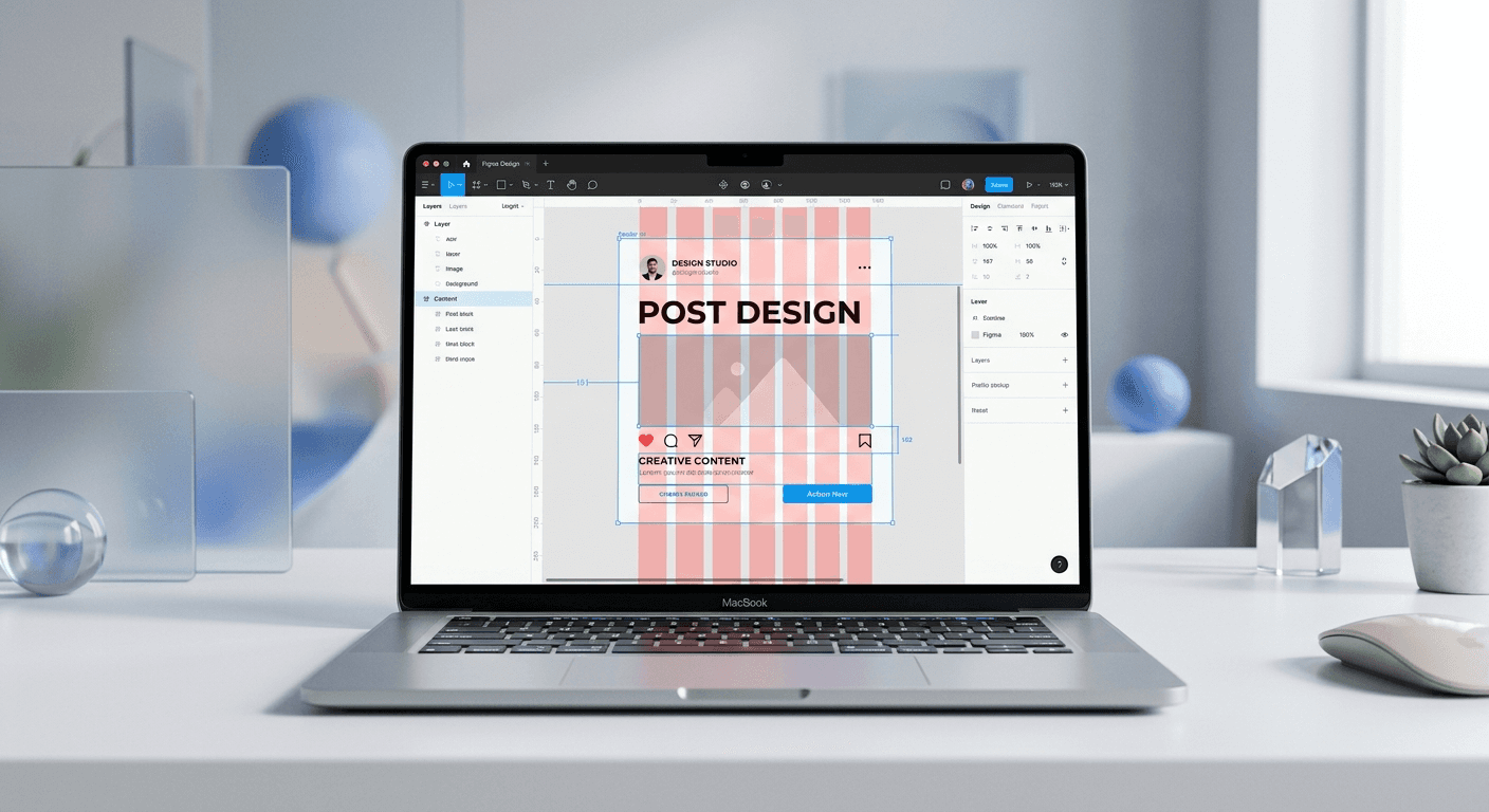
Top layout grids for figma marketing projects are created using the "Layout Grid" panel in the right-hand sidebar of the Figma interface. To start, select your frame and click the plus icon next to Layout Grid. You can then choose between a uniform grid, columns, or rows. For social media, columns are the most effective way to manage horizontal alignment. Set your count to 4, your margin to 64px, and your gutter to 20px for a standard, professional look.
Figma allows you to save these settings as Styles, which means you can apply them to any new frame with a single click. This feature is a major part of figma alignment systems 2026 workflows because it eliminates repetitive setup tasks. When you use styles, you ensure that every team member is using the exact same spacing rules. This is particularly important for agencies and startups where multiple people might be contributing to the marketing assets. A margin of 64px ensures that your content stays away from the edges of the screen, where it might be obscured by the app's interface elements. The gutter is the space between columns, and keeping it consistent prevents your design from looking cluttered or cramped. We recommend using an 8pt grid system for your gutters and margins to maintain mathematical harmony throughout your layout. This means every spacing value should be a multiple of eight.
Why is the 4-column layout the best column structures instagram uses?
The 4-column layout is the industry standard because it provides the perfect balance between simplicity and flexibility on mobile screens. On a 1080px wide canvas, 4 columns allow you to create 1-column, 2-column, or 4-column wide elements easily. This versatility is why these are the best column structures instagram creators use for high-engagement carousels. It allows for large, readable headlines while still leaving room for supporting imagery.
Research from Socialinsider (2024) indicates that carousels remain one of the highest-engaging post types on Instagram, often outperforming static images. To capitalize on this engagement, your layout must be easy to read at a glance. A 4-column grid facilitates this by naturally encouraging you to group information into digestible blocks. For example, you can use the first two columns for a large headline and the remaining two for a supporting graphic. Alternatively, you can center a single block of text across the middle two columns to create focus. This flexibility makes the 4-column grid ideal for the 1080x1350 vertical format, which takes up more screen real estate and attracts more attention in the feed. We build our minimalist Figma templates using this specific 4-column logic to help founders maintain a premium aesthetic without effort.
How can top rule of thirds layouts improve your visual hierarchy?
Top rule of thirds layouts are based on a 3x3 grid that divides your frame into nine equal parts. By placing your most important elements along the lines or at the intersections, you create a more dynamic and interesting composition than if you were to simply center everything. This technique has been used by painters and photographers for centuries to draw the viewer's eye to specific focal points. In social media design, the rule of thirds is excellent for balancing text with photography.
The rule of thirds works because it creates asymmetrical balance, which feels more natural and less forced to the human eye. When you place a subject in the left or right third of the frame, you leave "lead room" or "looking room" in the other two-thirds. This space can be used for your headline or a call to action. In Figma, you can set up a rule of thirds grid by using the "Grid" option instead of "Columns" and setting the size to 360px for a 1080px canvas. This creates three equal rows and three equal columns. Using this system ensures that your post feels balanced even when it is content-heavy. We find that founders who use this method see a noticeable improvement in how professional their custom graphics look. It is a simple mathematical trick that yields high-end results consistently.
Why do responsive design grids b2b companies use require more structure?
Responsive design grids b2b companies favor often focus on density and information clarity rather than purely aesthetic appeal. B2B audiences are usually looking for data, insights, or solutions to specific problems. Therefore, the grid must support more complex typography and data visualization. A 6-column or 12-column grid is often better suited for B2B marketing because it allows for more granular control over the placement of small details like charts and bulleted lists.
In the B2B sector, credibility is built through the professional presentation of information. If your data charts are misaligned or your text is too close to the edge, it signals a lack of attention to detail. Using a responsive design grids b2b framework ensures that your content looks just as good on a desktop browser as it does on a LinkedIn mobile feed. A 12-column grid is particularly useful here because it can be divided into halves, thirds, quarters, and sixths. This mathematical flexibility is essential when you need to present a three-step process or a four-part feature list. We suggest using a 12-column grid for any post that contains more than 50 words of text. This provides enough anchor points to keep the typography organized and readable. Consistency across these grids helps establish a cohesive brand identity, which is vital for long-term growth in the competitive B2B space.
How do figma alignment systems 2026 speed up content production?
Figma alignment systems 2026 rely heavily on Auto Layout and component-based design to automate the positioning of elements within a grid. Auto Layout is a feature in Figma that allows frames to grow or shrink based on the content inside them while maintaining consistent padding and spacing. When combined with a fixed grid, Auto Layout ensures that your design never breaks, regardless of how much text you add. This combination is the key to rapid content production for busy founders.
By using figma alignment systems 2026, you can create a single master slide that serves as a template for your entire carousel. When you change the text in one slide, the layout adjusts automatically to maintain the correct margins and gutters defined by your grid. This removes the need for manual resizing and re-alignment, which are the most time-consuming parts of the design process. According to general industry observations, moving from a manual design process to a systemized, component-based workflow can save hours of work per week. This saved time can be redirected toward high-level strategy or product development. We suggest building your templates with "Constraints" set to the grid. This ensures that if you change your frame from a square 1:1 ratio to a portrait 4:5 ratio, your elements will snap to the correct positions instantly. This level of automation is what allows small teams to produce the same volume of content as large marketing agencies.
What are the common mistakes to avoid when using grids?
The most common mistake when using grid systems is being too rigid or, conversely, ignoring the grid entirely when adding final touches. A grid is a guide, not a cage. Sometimes, an element like a floating icon or a decorative shape might look better if it sits slightly off the grid to create a sense of depth or movement. This is known as "breaking the grid," and it should be done intentionally rather than by accident. Another frequent error is using gutters that are too narrow, which makes the content feel cramped and difficult to distinguish.
Ignoring margins: Content that is too close to the edge gets cut off or looks cluttered.
Inconsistent gutters: Using different spacing between columns creates a disjointed visual rhythm.
Overcomplicating the grid: Using a 12-column grid for a simple quote post adds unnecessary complexity.
Manual alignment: Not using Figma's alignment tools leads to sub-pixel errors that look unprofessional.
Another mistake is failing to account for the platform's UI. For example, Instagram places a profile icon and a follow button over the top-left and top-right corners of some posts in the feed. If your grid does not account for these "dead zones," your headline might be obscured. We recommend keeping all vital text within a central safe area, which is easily defined by setting larger margins in your Figma layout grid. By avoiding these common pitfalls, you ensure that your best grid systems social media templates actually perform the job they were designed to do: communicate your message clearly and professionally.
How do you choose the right grid for your specific brand goals?
Choosing the right grid starts with identifying the primary goal of your content. If you are a SaaS founder trying to explain a complex workflow, a modular grid with clear rows and columns is your best choice. If you are a creator building a personal brand through storytelling, the rule of thirds will help you create more engaging, human-centric visuals. Your grid choice should reflect the personality of your brand: stable and organized brands use symmetrical grids, while modern and disruptive brands might use diagonal or asymmetrical layouts.
The most effective designers don't just use a grid; they use the same grid every time. This repetition is what creates a recognizable brand identity in a crowded social media feed.
We recommend starting with a 4-column system for 80% of your content. It is the most versatile and easiest to manage. As you become more comfortable with Figma, you can experiment with more complex 12-column systems for data-heavy posts or modular grids for feature comparisons. The key is to pick a system and stick with it. Consistency is more important than perfection. When you use the same mathematical rules for every post, you build a visual language that your audience will recognize before they even see your logo. This recognition is the foundation of brand equity. By using the best grid systems social media templates, you are investing in the long-term credibility of your company.


