How to Design a High-Converting LinkedIn Company Page Banner
Discover the exact 2026 LinkedIn company page banner dimensions. Learn how to design minimalist Figma templates that drive B2B engagement and generate leads.
The ideal LinkedIn company page banner size is exactly 1128 x 191 pixels. Treat this space as a premium B2B digital billboard by centering your core value proposition and strictly maintaining a safe zone for the mobile crop.
The LinkedIn company page banner operates as the digital storefront for your entire B2B marketing motion. Most startups simply upload a generic geometric pattern, completely wasting their most valuable above-the-fold visual real estate. You need a functional design system that instantly communicates your software's exact value proposition to executive buyers before they ever scroll down to read your company summary.
What is the optimal size for a LinkedIn company page banner?
The standard dimension for a LinkedIn company page banner is exactly 1128 pixels wide by 191 pixels high. This creates a wide aspect ratio that behaves differently than personal profiles, requiring precise element placement to ensure your branding remains fully visible across all screen sizes.
A LinkedIn company page banner is the primary horizontal graphic displayed immediately above your organizational profile. Unlike personal profiles which default to a taller format, corporate pages require a strictly wider 1128 x 191 pixel dimension layout to display correctly on desktop interfaces (Hootsuite, 2026). Because 41% of B2B ad budgets are now spent directly on LinkedIn campaigns (Thunderbit, 2026), optimizing this specific header real estate becomes a non-negotiable step before launching any paid acquisition. Designers must accommodate aggressive responsive cropping behavior across multiple viewing environments.
Desktop monitors display the header graphic at its full 1128-pixel horizontal width. Mobile screens severely crop the outer left and right edges, which means your critical text and logo marks must sit entirely within the center 800 pixels. Placing essential typography too close to the left boundary guarantees it will be completely hidden behind your square company logo. This mistake ultimately destroys your headline readability for the majority of users browsing the platform.
Why does your B2B LinkedIn cover photo matter?
Your B2B LinkedIn cover photo matters because it provides the initial visual confirmation of your company's market credibility. It actively transitions a profile visitor from a casual scroller into a highly interested prospect by clearly communicating your unique value proposition.
A B2B LinkedIn cover photo is the digital equivalent of a retail storefront window for enterprise and software companies. Executive buyers rarely read long descriptive summaries without first evaluating the visual authority of the company presence. Recent data indicates that 73% of decision-makers trust thought leadership on LinkedIn substantially more than traditional marketing collateral (Thunderbit, 2026). When those decision-makers click through to your brand profile, a blank or generic geometric background immediately signals an amateur operation.
To look like a premium entity, you must use the banner space to broadcast a hyper-specific positioning statement. A strong cover photo replaces confusion with immediate clarity. The design visually explains exactly who your software serves and what primary outcome it delivers within seconds of a profile visit. Companies that treat this real estate as an active conversion mechanism consistently command higher trust from prospects. Ultimately, a polished header graphic sets an immediate anchor of professionalism that carries through the entire subsequent buyer journey.
What are the best practices for SaaS header design?
The most effective SaaS header design relies on a strict minimalist layout featuring a single high-contrast headline, a subtle interface mock-up, and generous negative space. Clutter actively destroys conversion by confusing the visitor about where to look first.
SaaS header design is the practice of structuring software brand messaging into a condensed, highly legible visual format specifically built for social media platforms. The absolute best approach eliminates all unnecessary decorative elements in favor of raw informational clarity. Complex diagrams or dense paragraphs of text fail completely on social media because they require too much cognitive effort from the viewer. Instead, top-tier software companies distill their entire product offering into a maximum of five to seven words.
Incorporating multi-image carousels across your feed can drive 278% more engagement than standard video content (ShortsIntel, 2026). Your header graphic must mirror that exact same level of high-impact visual simplicity. The most successful software headers combine a bold typographic statement on the right side with a cleanly extracted product interface on the left. This intentional split-layout forces the viewer to process the core benefit before they even scroll down to read the company overview, accelerating the time to value significantly.
Core elements of minimalist layouts
You must strip away distractions to focus the buyer's attention. A professional software header relies on strict adherence to a few non-negotiable visual rules.
High-contrast typography: Black or dark grey text against a muted pastel or white background guarantees maximum legibility across all device brightness settings.
Single focal point: The design forces the viewer to read the headline first, completely eliminating competing graphic elements that distract from the main message.
Generous negative space: Empty space around the text block signals premium quality and gives the brand messaging room to breathe visually.
How do you optimize LinkedIn profile visuals for desktop and mobile?
You optimize LinkedIn profile visuals by designing strictly for the mobile crop safe zone before addressing the desktop layout. This method anchors your primary message precisely in the center third of the canvas while leaving the left edge completely empty.
Mobile-first optimization is a design workflow that prioritizes the smallest screen layout before scaling up to larger desktop dimensions. When applying this to social media, designers must map out strict safe zones to prevent critical information from being truncated. The most common mistake founders make is ignoring how the square profile picture overlaps the bottom-left corner of the header graphic on desktop displays. To correctly optimize LinkedIn profile visuals, you must build a protective padding system directly into your master canvas.
LinkedIn generated $17.81 billion in revenue primarily driven by engaged professional users (ShortsIntel, 2026). You cannot afford to present those users with broken or illegible brand assets. The safest approach demands perfectly centering your text block and pushing any background graphical elements completely to the outer margins. By establishing a rigid central column for your core copy, you guarantee that every single profile visitor receives the exact same brand experience regardless of the specific device or screen resolution they use.
Desktop vs mobile cropping specifications
The platform treats background images dynamically depending on the user's viewport. You must design to accommodate both extremes simultaneously.
Device Viewport | Visible Dimensions | Layout Behavior |
|---|---|---|
Desktop Monitor | 1128 x 191 px | Displays full width. Profile picture overlaps the bottom left corner completely. |
Mobile Application | ~800 x 191 px | Aggressively crops outer left and right edges. Only the center column remains visible. |
How do you build reusable Figma banner templates?
Building reusable Figma banner templates starts with establishing a master frame at the correct platform dimensions and configuring dynamic auto-layout constraints. This structural foundation allows marketing teams to update copy without ever breaking the underlying design grid.
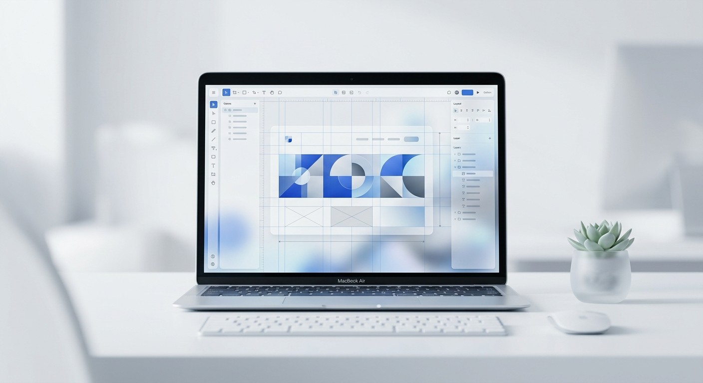
Auto-layout in Figma is a foundational feature that allows UI components and text frames to resize dynamically based on their internal content. When creating templates for social media headers, this tool becomes absolutely essential for maintaining strict brand consistency across multiple campaigns. To construct bulletproof Figma banner templates, you begin by wrapping your core headline and subheadline within a vertical auto-layout frame set to a rigid 24-pixel spacing. This specific grouping ensures that even if a copywriter changes a short headline to a much longer sentence, the vertical distance to the subtext remains mathematically perfect.
We build our templates with auto-layout to ensure consistency, which is exactly how the layouts in usevisuals scale effortlessly without breaking constraints. Efficient marketers rely heavily on these pre-configured systems because they completely eliminate the manual pixel-pushing process. You lock the master alignment to the center of the canvas, ensuring that future updates automatically respect the mobile safe zones established during the initial design phase.
Building the component architecture
You must structure your Figma file correctly from the start. A disorganized canvas leads to messy exports and inconsistent brand updates.
Establish the master frame: Press the frame tool and input exactly 1128x191 pixels into the right-hand properties panel.
Define the safe zone grid: Add a layout grid with large horizontal margins to visualize the mobile crop area.
Lock background elements: Place your brand color fill at the bottom of the layer stack and lock it to prevent accidental movement.
What elements make a high-converting corporate branding banner?
A high-converting corporate branding banner integrates a distinct value proposition, recognizable client logos for social proof, and a refined color palette. This exact combination transforms a static image into a silent sales asset that establishes immediate industry authority.
A corporate branding banner is a strategic visual asset deployed across company profiles to unify messaging and build sustained market trust. The highest-performing examples never rely on abstract stock photography or generic city skylines. Instead, they deploy concrete social proof points that validate the company's market position immediately upon a profile visit. When reviewing B2B marketing data, studies show that adding personalized context drives a significantly higher response rate of 9.36% compared to generic outreach (Belkins, 2025).
Your banner is that critical first layer of personalized context before a sales representative ever sends a direct message. By embedding recognizable logos of your current enterprise clients directly into the lower right corner of the header, you borrow their established credibility. This distinct visual hierarchy immediately guides the prospect's eye from your bold headline statement down to the undeniable proof of your execution. It is a highly calculated design decision that drastically lowers the perceived risk for any new buyer evaluating your software.
Your banner is not a piece of abstract art; it is a highly targeted piece of marketing real estate designed to convert attention into pipeline.
How do you export and upload social media banner dimensions 2026 accurately?
To correctly export the most current social media banner dimensions 2026, you must output your final design canvas as a high-resolution PNG file at a 2x scale. This specific setting actively prevents the platform from introducing blurry compression artifacts.
PNG exporting is a digital file generation process that preserves sharp typographic edges and solid color blocks better than standard JPG compression. When preparing your final header graphics for the web, the export methodology is just as important as the design itself. To properly output the standard social media banner dimensions 2026, you must navigate to the export panel and select the 2x multiplier before rendering the file. LinkedIn algorithms aggressively compress all uploaded image assets to conserve global server bandwidth.
Currently, there are over 1.2 billion registered members on the platform worldwide (ShortsIntel, 2026). That massive scale forces heavy image optimization on the back end. If you upload a graphic at exactly 1x resolution, the server compression will instantly blur your LinkedIn company page banner into an unreadable mess. Exporting at exactly double the intended size forces the platform to downsample a richer file, resulting in razor-sharp typography that preserves your premium brand perception perfectly across every single device screen.
Export settings for maximum clarity
Follow these exact specifications when pulling your final asset out of Figma. These settings guarantee the highest possible image fidelity once uploaded to the platform.
Format: Select PNG over JPG. PNG handles the sharp contrast between text and background colors without creating blurry pixel artifacts.
Multiplier: Set the export size to 2x. This outputs a 2256 x 382 pixel file that withstands algorithmic compression flawlessly.
Color profile: Ensure your Figma file is set to sRGB, as all web browsers and social applications render colors in this specific space natively.
References
Social media image sizes for all networks [April 2026]. Hootsuite, 2026.
LinkedIn B2B Marketing Statistics and Trends for 2026. Thunderbit, 2026.
LinkedIn Statistics 2026: Members, Revenue, Engagement Data. ShortsIntel, 2026.
What are B2B LinkedIn Outreach Benchmarks? (2025 Study). Belkins, 2025.


