8 Top Ways to Increase LinkedIn Carousel Engagement in 2026
Discover the top ways to increase linkedin carousel engagement using design-led strategies. Learn how to optimize PDF documents and hooks to grow your brand.
The top ways to increase linkedin carousel engagement involve prioritizing high-contrast cover slides, optimizing for mobile readability, and leveraging the LinkedIn algorithm's dwell-time metrics. By focusing on professional design hierarchy and clear visual cues, you can achieve engagement rates up to five times higher than standard posts.
The top ways to increase linkedin carousel engagement rely on a blend of psychological triggers and technical design execution. We find that the most successful founders do not just share information; they package it in a format that rewards the user for swiping. LinkedIn rewards document-based posts because they keep users on the platform longer, which signals to the algorithm that your content is high-quality and worthy of further distribution.
To succeed in 2026, you must move beyond generic advice and focus on the technical details of your visual assets. This includes everything from the specific aspect ratio of your PDF export to the kerning of your headlines. High-performing carousels act as a mini-landing page for your brand. If the design is cluttered or the hook is weak, users will scroll past before your message has a chance to land.
What is the current benchmark for LinkedIn carousel engagement?
The benchmark for a successful LinkedIn carousel is defined by its ability to generate high dwell time and repeat swipes. In our experience, a carousel that achieves an engagement rate above 2% is performing in the top tier of B2B content. This metric is a direct reflection of how well your visual hierarchy guides the reader from one slide to the next without friction.
LinkedIn carousels, formally known as document posts, currently outperform every other content format on the platform regarding organic reach and user interaction. Recent industry benchmarks indicate that carousels achieve an average engagement rate of 1.92%, which is significantly higher than the engagement seen on standard image posts (Socialinsider, 2024). This performance gap exists because the LinkedIn algorithm measures dwell time as a primary signal for content quality. When a user swipes through a ten-slide document, they spend significantly more time on that post than they would on a text update or a single photo. This extended interaction signals to the algorithm that the content is valuable, which triggers a wider distribution across the feeds of second and third-degree connections. For founders and agencies, this means that visual storytelling is no longer a luxury but a fundamental requirement for maintaining visibility in an increasingly competitive feed.
Dwell time is the secret engine behind the LinkedIn algorithm. Every second a user spends on your slide contributes to your reach. This is why multi-slide documents often go viral even when they have fewer initial comments than text-heavy posts.
Why are high-contrast cover slides the best linkedin hook strategies?
The answer is visual weight. Your cover slide has exactly 1.5 seconds to capture attention in a fast-moving feed, and best linkedin hook strategies prioritize high-contrast color palettes and oversized typography to stop the scroll. If your background and text colors are too similar, the brain filters your content as background noise.
Effective hooks are built on the principle of the "Gap Theory," where you present a problem or a transformation that the user feels compelled to resolve by swiping. Research into visual attention suggests that users identify the central focus of a slide within 13 milliseconds, meaning your primary headline must be the largest and most distinct element on the page. We recommend using a contrast ratio of at least 7:1 for text against its background to ensure accessibility and visibility even on dim mobile screens. A common mistake is using thin, elegant fonts that look great on a 27-inch monitor but disappear on a smartphone. Instead, use bold, sans-serif fonts like Inter or Helvetica Neue at a minimum size of 80px for headlines. This design choice ensures your message is readable as the user scrolls, effectively forcing them to pause and process your hook before they move on.
Contrast is not just about color; it is also about whitespace. A minimalist design with a single, punchy sentence is often more effective than a busy slide packed with icons and logos. We suggest keeping your cover slide focused on one specific outcome or pain point.
How do you optimize linkedin pdf documents for mobile readability?
You must optimize linkedin pdf documents by using a vertical 4:5 aspect ratio (1080x1350 pixels) instead of a square 1:1 format. This specific ratio occupies more vertical real estate on mobile screens, which accounts for over 57% of LinkedIn traffic. More screen coverage means fewer distractions from the posts above and below yours.
Mobile optimization extends to the technical export settings in your design software. LinkedIn processes PDF files by converting each page into an image, which can sometimes lead to blurry text if the original file resolution is too low. We suggest exporting your slides as 300 DPI PDFs to maintain crispness across all devices. Furthermore, the file size should be kept under 100MB to ensure fast loading times on cellular data connections. If a carousel takes too long to load, the user will skip it, killing your engagement metrics before the first swipe. Another critical factor is the "safe zone" for UI elements. LinkedIn overlays a progress bar and navigation arrows on your carousel slides, so you must leave at least 150px of empty space at the top and bottom of your design. This prevents your branding or key text from being obscured by the platform's native interface elements, ensuring a professional and unobstructed reading experience.
Readable text is the foundation of trust. If a user has to pinch-to-zoom to read your content, you have already lost them. We recommend testing your font sizes on a mobile device before finalizing your export.
Does the F-Pattern layout help you get more views on linkedin carousels?
The answer is yes. Designing your slides to match the F-Pattern reading behavior helps you how to get more views on linkedin carousels by placing the most important information where eyes naturally land. Users typically scan content in a horizontal movement across the top, followed by a second horizontal scan slightly lower, and finally a vertical scan on the left side.
The F-Pattern is a well-documented eye-tracking behavior where readers prioritize the top and left-hand side of a page while ignoring the bottom right. When you apply this to carousel slides, you should place your headlines in the top left and use your secondary visual elements to lead the eye toward the right edge, signaling that there is more to see. A study by the Nielsen Norman Group (2024) confirms that users spend 80% of their time looking at information above the fold. In a carousel context, this means your core insights must be positioned in the upper half of the slide. If you place a critical piece of data in the bottom right corner, most users will miss it as they swipe. By aligning your design with natural scanning habits, you reduce the cognitive load on the reader. This makes your content feel easier to consume, which encourages them to finish the entire slide deck. Higher completion rates tell the LinkedIn algorithm that your content is high-performing, which leads to increased reach and views.
Visual cues like arrows or small text prompts such as "Swipe for more" act as directional signals. These simple additions can increase swipe-through rates by up to 20% because they explicitly direct the user's next action. We suggest placing these cues in the bottom right corner, as that is the natural exit point for the eyes.
Why do progress bars help boost linkedin reach visual content?
Progress bars are a powerful tool to boost linkedin reach visual content because they tap into a psychological phenomenon known as the "Zeigarnik Effect." This effect states that people remember uncompleted tasks better than completed ones, creating a subconscious drive to reach the end of the sequence.
Including a visible progress indicator, such as a line at the bottom or a page counter (e.g., 03/10), provides the user with a sense of orientation and accomplishment. Without a progress bar, a user might feel that a carousel is never-ending and drop off early. However, when they see they are on slide seven of ten, they are statistically more likely to finish the final three slides. Data suggests that content with clear progress indicators can see a 15% increase in completion rates compared to those without them. On LinkedIn, every slide swipe is tracked. If you have 100 people start your carousel and 80 of them reach the final slide, your post will be pushed to a much wider audience than if only 20 people finished it. This is because high completion rates are a definitive proof point of content value. By giving users a visual map of their progress, you are making it psychologically easier for them to consume your entire message, which directly influences your total reach and engagement.
We recommend a minimalist progress bar that does not distract from the main content. A simple 4px line that grows from left to right as the user swipes is an elegant solution that signals professional design quality.
How do design systems help maintain linkedin carousel best practices 2026?
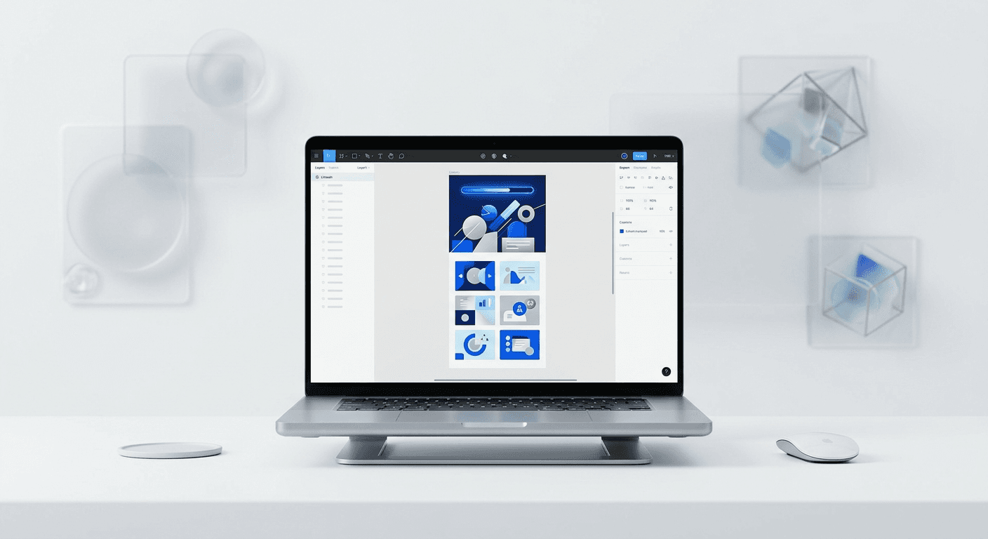
Using a design system ensures you follow linkedin carousel best practices 2026 by providing a consistent framework for every post. A design system is a collection of reusable components, like standardized fonts, colors, and layout grids, that allow you to produce high-quality visual content without starting from scratch each time.
For SaaS founders and agency owners, speed is just as important as quality. If it takes you four hours to design a single carousel, your marketing workflow is not sustainable. By using a Figma-based system with pre-built templates, you can reduce your content creation time by 70% while maintaining a premium brand identity. We suggest building a master library of slide layouts including intro slides, data visualization slides, and call-to-action slides. When you need to post, you simply swap the text and images. This ensures that every carousel you publish has the same margins, typography, and color tokens, which builds brand recognition over time. Consistent design helps your audience recognize your content instantly in their feed, even before they read your name. You can get access to premium Figma carousel templates to streamline this entire process. Using professional templates eliminates the guesswork of layout and spacing, ensuring that your content always meets the technical standards required for high engagement on LinkedIn.
Consistency is the hallmark of an established brand. When your carousels look cohesive, you signal to potential clients that you pay attention to detail and value professional presentation. This builds trust before you even have a direct conversation.
What are the common technical errors that kill carousel engagement?
The most common errors include using too much text, poor image resolution, and ignoring accessibility standards like alt-text. If a slide contains more than 50 words, the cognitive load becomes too high, and users will likely abandon the carousel. You must treat each slide as a single thought, not a paragraph.
Element | Common Error | Best Practice |
|---|---|---|
Text Volume | Cramming 100+ words per slide | Limit to 25-40 words per slide |
Font Size | Using 12pt or 14pt fonts | Minimum 24pt for body, 80pt for hooks |
File Format | Uploading PNG or JPG galleries | Upload as a single PDF document |
Contrast | Light gray text on white background | Black or dark navy on white/cream |
Another major mistake is neglecting the document title when uploading to LinkedIn. The filename of your PDF becomes the visible title of the post in certain views and affects SEO. Instead of naming your file "final_carousel_v2.pdf," use a descriptive, keyword-rich title like "8-strategies-for-linkedin-growth.pdf." Furthermore, accessibility is often overlooked. Providing a text-based summary in the post caption ensures that users with visual impairments can still engage with your message. LinkedIn also allows you to add alt-text to your images when uploading documents. Taking the extra minute to describe your slides improves your standing with the algorithm and broadens your potential audience. Clean technical execution is what separates amateur creators from established authorities.
We find that simplicity is the most effective technical strategy. A clean layout with sharp images and large text will always outperform a complex, over-designed carousel that is hard to read on a small screen.
How do you summarize the top ways to increase linkedin carousel engagement?
To conclude, the top ways to increase linkedin carousel engagement involve a commitment to high-quality design and a deep understanding of user psychology. Start with a high-contrast hook that addresses a specific pain point, use a 4:5 vertical ratio for mobile dominance, and include a progress bar to drive completion rates. Remember to keep your text density low and your font sizes large to ensure every slide is readable in a split second.
By implementing these linkedin carousel best practices 2026, you transform your social media presence from a series of random posts into a cohesive brand experience. The algorithm favors those who provide value in a format that is easy to consume and visually professional. Focus on the dwell time, respect the mobile user's experience, and use design systems to stay consistent. When you treat your visual content as a product, your engagement metrics will reflect that investment through increased leads, followers, and brand authority.


