How to Use Glassmorphism Figma Social Media Design for Premium Branding
Master the glassmorphism figma social media design trend to elevate your brand. Learn the exact background blur values to build premium carousel posts.
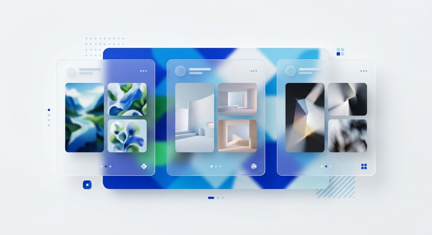
What is glassmorphism Figma social media design? It is a layered visual technique that uses transparency and background blur combined with light borders to mimic frosted glass. This aesthetic elevates your brand, captures attention, and dramatically increases engagement on professional networks like LinkedIn.
What makes glassmorphism the dominant aesthetic for SaaS marketing?
Glassmorphism is a visual design style that uses transparency and background blur combined with light borders to mimic frosted glass. This aesthetic dominates SaaS marketing because it creates spatial depth without adding unnecessary visual clutter. The layered approach organizes complex information cleanly. It signals technical sophistication and replaces outdated flat design with a premium interface.
The shift toward spatial interfaces has fundamentally changed user expectations for digital content. Apple integrated this frosted glass aesthetic directly into Apple Vision Pro and macOS, establishing it as the default visual language for modern computing (NN/G, 2024). Audiences now associate translucent overlays and blurred backgrounds with premium technology products.
Flat design no longer signals innovation. It feels dated compared to the dimensional interfaces users navigate daily. Modern saas aesthetics require visual depth to communicate platform quality. When a software company deploys a glassmorphism Figma social media asset, they position the brand as current and authoritative.
This visual positioning directly impacts consumer trust. A compelling 53% of consumers believe that clever design makes products stand out from their competitors (PC Social, 2022). Visual identity is a proxy for product quality. You must adopt these UI trends in marketing to maintain a competitive edge.
Why do LinkedIn carousels require premium visual branding?
LinkedIn carousels require premium visual branding because the format demands sustained user attention across multiple slides. High-quality design builds the credibility necessary to keep users swiping. A cheap aesthetic causes immediate abandonment. Poor presentation completely wastes the educational content written on the slides.
Multi-image formats achieve exceptional reach when they use premium visual branding to stop the feed scroll. Carousel posts currently generate an average engagement rate of 24.42%, drastically outperforming standard text updates across professional networks (PostNitro.ai, 2025). This metric proves that B2B audiences actively reward high-quality visual content with their attention.
You cannot expect strong performance from amateur layouts in a competitive timeline. Professionals consume content that reflects their own standard of quality and expertise. When you publish a glassmorphism Figma social media template, you signal authority immediately. The transparent layers create a sophisticated depth that interrupts standard scrolling patterns.
Flat design simply blends into the background noise. A layered composition captures initial attention and holds it through the entire document sequence. Marketers who master this specific aesthetic consistently drive better lead generation outcomes. The engagement multiplier more than justifies the initial design effort required.
What is the exact mathematical formula for the frosted glass effect in Figma?
The frosted glass effect in Figma requires precise mathematical values to look professional. You need a background blur between 30 and 40 pixels. You must also apply a white fill at 10% opacity and a 1-pixel inner white stroke at exactly 20% opacity.
Building the frosted glass effect figma settings requires strict adherence to mathematical contrast rules. The ideal background blur figma setting sits precisely between 30 and 40 pixels, which obscures the background enough to ensure text legibility while retaining color dynamics (FasterCourse, 2021). You must combine this blur with a solid white fill set strictly to 10% or 15% opacity. Higher opacity values destroy the glass illusion and create muddy blocks.
The most critical component is the edge highlight, which mimics light hitting physical glass. You achieve this with a 1-pixel inside stroke, colored pure white, and set to 20% opacity. This sharp border separates the translucent card from the blurred background.
Without this stroke, the elements bleed together and ruin the spatial hierarchy. Precise application of these exact values guarantees a professional result every single time. Guessing these parameters inevitably leads to amateurish visuals that damage brand perception.
Figma Property | Setting | Value | Opacity |
|---|---|---|---|
Fill | Solid White | #FFFFFF | 10% - 15% |
Stroke | Inside | 1px #FFFFFF | 20% - 25% |
Effects | Background Blur | 30 - 40 | N/A |
Effects | Drop Shadow | Y: 8, Blur: 32 | 10% Black |
How do you build a reusable glass card template?
Building a reusable glass card template requires combining the frosted effect with the Figma auto-layout feature. You design one master component with the glass properties. You then wrap it in an auto-layout frame and save it as a primary design asset.
Auto-layout in Figma is a feature that lets components resize dynamically based on their content. You must pair this automatic resizing with your glass layer to build an efficient production system. Through extensive template building, we learned that creating individual slides manually wastes hundreds of hours annually. A systematic approach ensures complete visual consistency across every post.
We recommend establishing a master component that contains your precise blur and stroke values. You then place your text layers inside this master container. When you write a new post, the glass card expands perfectly to accommodate the character count. This workflow removes friction from the content creation process.
If you prefer to bypass the technical setup phase entirely, you can apply our Figma carousel templates directly to your content workflow. Efficient systems allow founders to focus entirely on copywriting rather than pixel pushing. Speed of execution dictates marketing success.
What are the common accessibility mistakes with background blur?
The most common accessibility mistake with background blur is placing thin, low-contrast text over a highly noisy background gradient. Transparent UI elements inherently reduce contrast ratios. You must compensate by using thick font weights and severely limiting background color variations.
Accessibility suffers when designers prioritize the glass aesthetic over fundamental typographic legibility. Placing delicate sans-serif fonts over translucent panels creates severe readability issues for visually impaired users. Apple encountered significant usability complaints regarding contrast ratios when they launched their highly translucent Vision Pro interface (Substack, 2025). The background colors bled through the frosted panels and obscured critical navigation text.
You must learn from these high-profile interface failures. Never use a font weight lighter than medium or semibold on a glass card. The text must fight through the background noise to remain visible.
You should also restrict your background gradients to analogous colors rather than high-contrast complementary pairings. A soft blend of deep blues provides a stable canvas. A chaotic mix of bright colors will shine through the blur and destroy text contrast entirely. Social media scrollers will simply swipe past anything they cannot read instantly.
How does visual depth improve audience retention?
Visual depth improves audience retention by creating an intuitive hierarchy that guides the reader naturally. Layered elements tell the brain exactly which information to process first. The glassmorphism style physically separates the primary message from the decorative background behind it.
Cognitive processing speeds increase dramatically when information is presented with clear spatial boundaries. The human brain interprets drop shadows and blurred backgrounds as physical distance. This perceived distance dictates visual importance. The multi-image carousel format uses this psychology brilliantly to maintain attention.
LinkedIn carousels generate a staggering 596% more engagement than single text-only posts (Postunreel, 2026). The swipeable structure combined with dimensional design keeps the user actively involved. Flat graphics force the eye to work harder to determine what matters. A glass card lifts the core message off the screen and hands it directly to the reader.
This reduction in cognitive load directly prevents feed abandonment. When users process your frameworks easily, they spend more time consuming your perspective. Increased dwell time signals high quality to algorithmic distribution systems. This technical aesthetic strategy directly manipulates the platform mechanics in your favor.
What are the best practices for this aesthetic?
The best practices for this aesthetic revolve around strict restraint and consistency. You should never apply the glass effect to more than two elements per slide. Overuse creates visual chaos. This completely ruins the minimalist look you want to achieve.
Restraint separates professional design systems from amateur experiments. You must isolate the glass effect to your primary content containers to maintain its impact. Applying blur to every shape on the canvas destroys the required contrast between foreground and background. This aesthetic exists specifically to highlight your most valuable insights.
Thought leadership content on professional platforms generates exactly 2x more engagement than standard company-centric promotional posts (SocialPilot, 2025). Your visual presentation must match the caliber of your strategic thinking. Use strong, bright background gradients to ensure the frosted effect actually registers. Dull backgrounds render the transparency completely invisible.
Add a subtle drop shadow beneath the glass card to reinforce the spatial separation. We suggest setting the shadow opacity strictly at 10% to prevent muddy edges. These minor technical details compound to create an elite, authoritative presence. Precision builds trust with a discerning software audience. A proper glassmorphism Figma social media execution always elevates your corporate narrative.
Critical Rules for Production
Applying these visual rules requires a methodical approach to component management. Review these structural guardrails before shipping your next campaign:
Limit overlapping glass: Stacking multiple blurred layers heavily degrades rendering performance and muddies the visual hierarchy.
Anchor with solid typography: Use absolute black or pure white for your primary text content to combat the reduced contrast of the translucent layer.
Maintain ample padding: Your text should never touch the white-alpha border of your card.
Test on mobile screens: A blur effect that looks perfect on a 4K monitor might render as an unreadable smudge on a smartphone.
References
Glassmorphism: Definition and Best Practices. NN/G, 2024.
B2B Graphic Design Statistics and Insights Report. PC Social, 2022.
LinkedIn Carousel Engagement Stats 2025: Data-Driven Tips. PostNitro.ai, 2025.
How to create glassmorphism effect in Figma. FasterCourse, 2021.
Glassmorphism at Apple: New Old Trend And New Old Troubles. Substack, 2025.
LinkedIn Carousel Engagement 2026 Data & 6.60% Benchmark. Postunreel, 2026.
LinkedIn Carousel Posts: Specs, Steps And Examples. SocialPilot, 2025.


