Responsive blog images without a slow or confusing page
Create responsive blog images through one owned master, purposeful renditions, stable fallbacks, accessible meaning, and a testable handoff.
A designer exports a beautiful featured image at full resolution. The editor uploads it to the CMS, sees a crisp preview, and publishes. On a phone, the same file is several times larger than the screen needs. The crop hides the important detail, the filename says final-v7, and the image exists only as a CSS background that some crawlers cannot discover.
The problem is not simply compression. The publishing system has treated one design file as one web image.
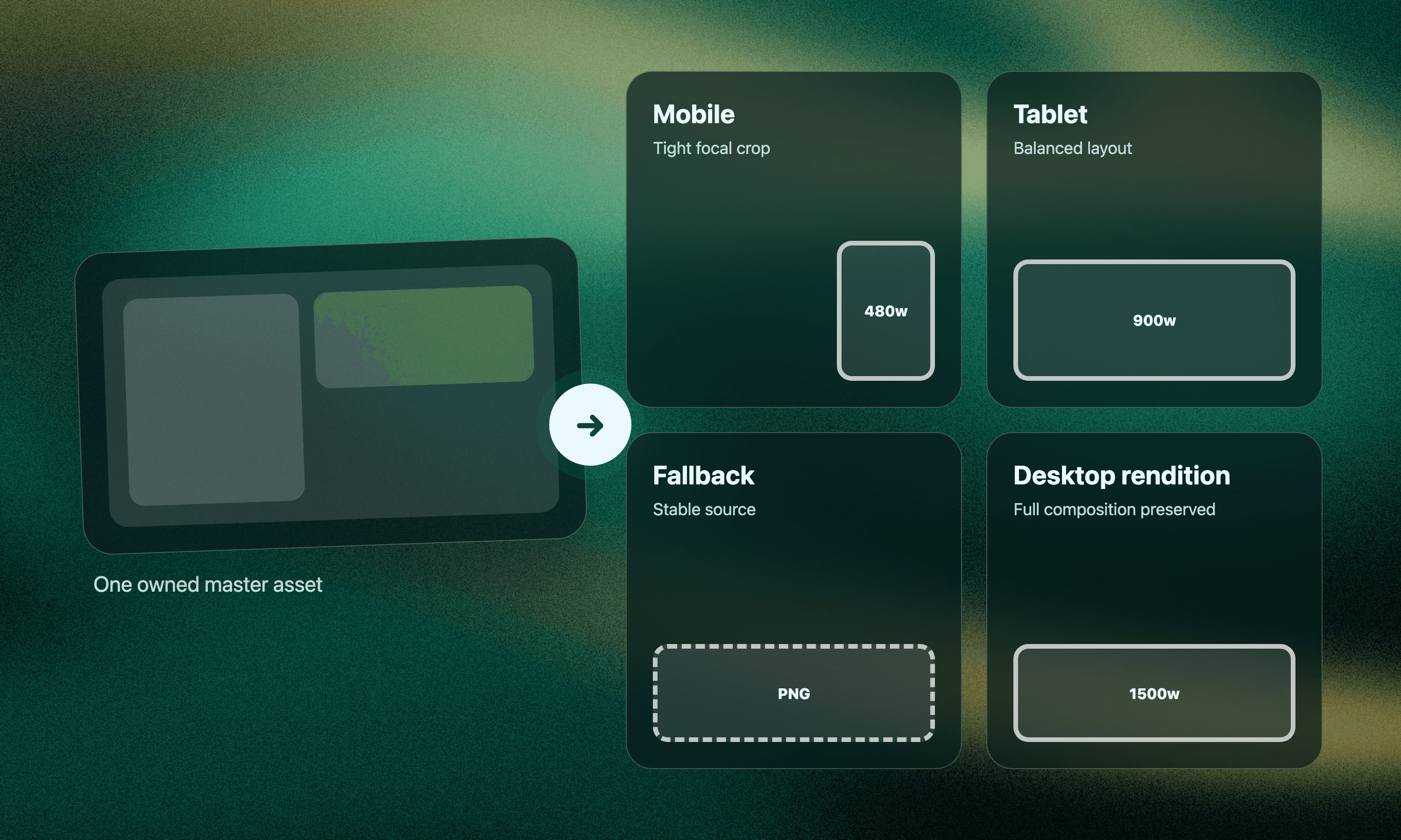
Responsive blog images work better when the team defines a master asset and a set of purposeful renditions. Each rendition has a viewing context, dimensions, crop behavior, format, fallback, and meaning. The browser can then select an appropriate file without forcing the editor to create a different article for every screen.
The useful unit is an asset passport, not an isolated upload.
Start with the image's job
Before discussing formats or markup, name what the image must communicate.
A featured image may introduce the article topic. A diagram may explain a relationship. A screenshot may prove that a setting exists. A decorative texture may create atmosphere without carrying information. These jobs affect cropping, alt text, captions, and whether the image can safely disappear on a narrow screen.
Write one sentence for the asset.
“This image helps a small content team understand the relationship between one source file and several delivery renditions.”
That sentence protects the meaning during later technical decisions. If a mobile crop removes the rendition labels, the crop has failed even if it looks balanced.
Give each asset a passport
The passport travels with the image from design through CMS upload and future maintenance. It can be a row in a content package, a JSON object, or a small form in the publishing workflow.
Include these fields.
Stable asset name and owning article
Visual job and whether the image is informative or decorative
Master source file location
Approved focal area and crop constraints
Required width variants
Approved formats
Fallback file
Alt text or empty-alt decision
Caption and credit where needed
Owner and update trigger
The passport separates design truth from individual exports. A new format can be generated later without guessing which file was authoritative or what the crop was meant to preserve.
Understand the three delivery patterns
Responsive image markup is easier to review when each pattern has a clear job.
One composition at several widths
Use srcset when the image composition stays the same and the browser should choose an appropriate file size. A 480-pixel rendition may serve a narrow screen while a larger rendition serves a wide content column.
The sizes attribute helps the browser understand how much layout space the image will occupy. This is a layout promise, so it should reflect the actual CSS rather than a copied example.
Different crops or formats
Use the picture element when the browser needs a choice between art-directed crops or file formats. A mobile source might use a tighter crop that preserves the central interface, while a desktop source uses the full landscape composition.
Format sources can also offer AVIF or WebP while retaining a broadly supported fallback. The order and media conditions should be tested in real layouts.
One essential fallback
Every responsive setup still needs an img element with a usable src. Google's image SEO guidance recommends standard HTML image elements and says that Google can discover images in the src attribute, including an img inside picture. The same guidance notes that CSS background images are not indexed as page images.
The fallback is not a forgotten compatibility file. It is the stable baseline that keeps the image meaningful when advanced selection does not run.
Read a markup example as a contract
Consider a diagram that appears at a maximum width of 900 pixels in an article.
The exact widths and formats are examples, not a universal recipe. The important relationships are visible.
Every source represents the same meaningful asset unless art direction is intentional
The browser receives several width choices
The layout size helps it choose before download
The fallback remains a real image with dimensions and alt text
Width and height preserve the aspect ratio and help reserve layout space
The editor does not need to write this markup by hand if the CMS generates it. The editor does need to know whether the generated result preserves these relationships.
Choose formats by content, not fashion
Modern formats can reduce file size, but the right source depends on the visual.
Photographs and textured artwork often compress differently from flat interface graphics. Screenshots need sharp text. Logos and simple illustrations may work well as SVG when the source and security policy permit it. PNG can remain useful for lossless graphics and transparency, though it may be costly for photographic images.
Google currently lists BMP, GIF, JPEG, PNG, WebP, SVG, and AVIF among supported image formats in its image guidance. Support in search does not remove the need to test browser delivery, CMS transformations, color fidelity, and file weight.
Do not create every possible format because a tool can. Create the smallest set that your delivery system can generate, cache, and verify consistently.
Protect meaning during art direction
A responsive crop should not turn an informative visual into decoration.
Define the safe focal area in the passport. For a topic-specific UI image, that may include the main panel, its labels, and the relationship between objects. For a portrait, it may include the subject and contextual object. For a chart, cropping may be unacceptable because axes or labels would disappear.
When the same crop cannot work across layouts, create a deliberate mobile composition rather than letting the CMS guess. Keep the alt text focused on the communicated idea, not the pixel arrangement. If the mobile and desktop versions communicate materially different information, reconsider whether they are truly renditions of one asset.
Separate alt text from filenames and captions
These fields have different readers and jobs.
The filename supports asset management and can provide a clean descriptive identifier. The alt text communicates the image's meaningful contribution when the visual is unavailable. A caption adds visible context that benefits everyone. A credit records ownership or source when required.
Do not force the primary keyword into all four fields. Write each one for its own purpose.
For a decorative image, an empty alt attribute may be appropriate under the site's accessibility policy. The HTML element should still be present and correctly formed. For an informative diagram, the alt text should summarize the relationship, while nearby article text carries the full explanation.
Make the handoff testable
A designer handing over one large PNG has not completed responsive delivery. A developer generating twelve variants without recording the source has not completed it either.
Use an acceptance test that both sides can understand.
Open the article at narrow, medium, and wide viewport sizes
Confirm that the focal content remains visible
Inspect which resource is downloaded at each size
Check that the fallback source opens directly
Verify the intrinsic dimensions and aspect ratio
Read the page with images disabled or alt text exposed
Confirm that the asset can be found from its passport and owner
Also check the final page weight in context. A well-compressed image can still be excessive when several similar assets load together. Lazy loading may help below-the-fold images, but the main image may need different priority treatment. Performance decisions belong with the page layout, not a generic checkbox.
Keep the system small enough to maintain
Begin with one or two standard aspect ratios, a documented width set, and a format policy the CMS can produce reliably. Add special art direction only where the image's job requires it.
When a blog template changes, review the sizes rules and crop assumptions. When a brand system changes, preserve the master files and regenerate renditions from them. When an article is updated, decide whether the image meaning still matches the revised content.
Responsive blog images are not a pile of exports. They are a controlled family derived from one owned asset. The passport preserves the editorial intent, the markup gives browsers useful choices, and the acceptance test proves that the live page delivers the right visual at the right size without losing its meaning.