Master the Ideal LinkedIn Carousel Aspect Ratio for Mobile (2026 Guide)
Discover the perfect linkedin carousel aspect ratio for mobile success. Learn slide size pixels, PDF dimensions, and layout tips to boost engagement instantly.
Social media consumption has shifted almost entirely to handheld devices. In 2026, professionals do not just scroll LinkedIn at their desks; they scroll during commutes, coffee breaks, and between meetings. This shift makes the linkedin carousel aspect ratio you choose a critical factor in your content strategy. If your visuals do not occupy enough screen space, you lose attention.
This guide explores the specific dimensions, pixel requirements, and design strategies needed to dominate the LinkedIn feed. We will cover technical specifications and provide actionable advice to ensure your content looks crisp on every device.
Why Aspect Ratio Matters for LinkedIn Growth
The aspect ratio of your content dictates how much vertical space you claim in a user's feed. A post that takes up more physical space on a phone screen creates a more immersive experience. It momentarily removes distractions from other posts or advertisements above and below your content.
When you optimize the linkedin carousel aspect ratio, you increase the "stop-scrolling" power of your post. Statistics show that vertical content receives significantly higher engagement rates compared to landscape images. This is simply because the content is larger and easier to read without zooming.
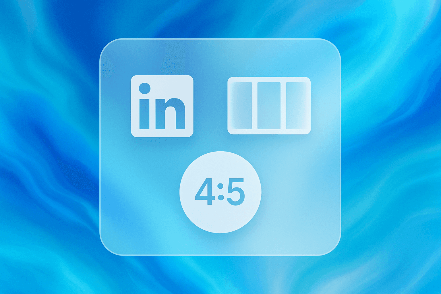
Defining the Best LinkedIn Carousel Aspect Ratio
There are two primary aspect ratios used for LinkedIn documents (carousels): Square and Portrait. While landscape (16:9) exists, it is widely considered ineffective for carousels because it appears very small on mobile devices.
The Gold Standard: Portrait Dimensions
The most effective linkedin carousel aspect ratio is 4:5. This vertical format is the standard for mobile-first viewing. It fills the majority of a smartphone screen while leaving just enough room for the caption and reaction buttons.
Ratio: 4:5
Dimensions: 1080 x 1350 pixels
Best for: Maximizing attention, storytelling, and detailed educational content.
The Classic Approach: Square Dimensions
The 1:1 square ratio is a safe, traditional choice. It works well on desktop browsers and is easy to repurpose for Instagram grids. However, it occupies less vertical space than the 4:5 ratio.
Ratio: 1:1
Dimensions: 1080 x 1080 pixels
Best for: Cross-posting to platforms that restrict vertical height; simple quotes or branding.
Comparing Portrait vs Square Performance
When analyzing portrait vs square formats, the portrait (4:5) ratio consistently outperforms square (1:1) on mobile apps. The extra 270 pixels of height in a 1080 x 1350 layout provide more room for white space. This makes text less cramped and easier to digest. In the competitive landscape of 2026, taking up that extra screen real estate is a distinct advantage.
Exact Slide Size Pixels and Specifications
To ensure your images remain sharp on high-resolution Retina and OLED displays, you must adhere to specific slide size pixels. LinkedIn compresses images upon upload, so starting with a high-resolution canvas is essential to prevent artifacting.
Recommended Pixel Dimensions for Clarity
For the optimal 4:5 linkedin carousel aspect ratio, set your design tool canvas to 1080 pixels wide by 1350 pixels tall.
Do not use smaller dimensions. While LinkedIn officially supports lower resolutions, 1080 width is the industry standard for clarity. If you use Figma or similar tools, you can even design at 2x scale (2160 x 2700 px) and export at 50% or standard size to ensure edges remain crisp.
Handling PDF Dimensions for Export
It is important to remember that a LinkedIn carousel is technically a PDF document upload. The platform parses the pages of the PDF into swipeable slides.
Your PDF dimensions must match your design pixels exactly. If your design is 1080 x 1350 px, your exported PDF page size should reflect that same ratio. Inconsistent page sizes within a single PDF document can cause errors or display glitches; ensure every page in your document has identical measurements.
Mobile-First Optimization Strategies
Choosing the right linkedin carousel aspect ratio is only the first step. You must design the content inside that rectangle specifically for mobile users. This is known as mobile-first optimization.
Designing for the Mobile Safe Zone
On a mobile device, certain areas of your slide might be obscured by the user interface (UI).
Bottom Overlay: LinkedIn places a semi-transparent overlay at the bottom of the slide showing the page count (e.g., "1 of 5") and sometimes a "next" arrow.
Top Bar: On some devices, the top edge can feel crowded by the app's navigation header.
To fix this, leave a "safe zone" or padding of at least 120 pixels at the bottom of your design. Do not place critical text, logos, or calls to action in this bottom strip.
Font Sizing and Legibility Rules
Small text kills engagement. On a mobile screen, users should not have to squint.
Headlines: Use a minimum of 60pt font size (based on a 1080px wide canvas).
Body Text: Use a minimum of 36pt to 40pt font size.
Contrast: Ensure high contrast between text and background. Dark text on light backgrounds generally offers the best readability for long-form reading on screens.
Using a Social Media Kit for Consistency
Creating high-quality carousels from scratch for every post is time-consuming. It involves setting up grids, guides, and safe zones repeatedly. To streamline this process, professional creators often utilize a design system.
Benefits of Pre-Made Layout Grids
A robust system ensures your linkedin carousel aspect ratio is always correct without manual checking. Using a Social Media Kit allows you to drag and drop content into pre-set frames that already account for mobile safe zones.
These kits, often available for Figma, provide a foundation of grids that maintain alignment across all slides. When you use a Social Media Kit, you ensure that your branding remains consistent. The layout grids included in these kits help balance text and visuals, preventing the slide from looking cluttered. This workflow efficiency allows you to focus on the writing and value of your content rather than pixel-pushing.
Step-by-Step Guide to Exporting Carousels
Once your design is complete, the export process determines the final quality of your post. A common mistake is exporting as individual images (JPG or PNG) rather than a multi-page document.
Converting Images to PDF Correctly
Design Phase: complete your design in your chosen software.
Selection: Select all the frames or artboards you wish to include.
Order: Verify the numbering of your slides is correct (1, 2, 3, etc.).
Format: Choose "PDF" as the export format.
Color Profile: Ensure you are exporting in sRGB. Print color profiles (CMYK) will look neon or washed out on digital screens.
Managing File Size Without Losing Quality
LinkedIn has a file size limit for documents. While the limit is generous (up to 300MB in 2026), it is best practice to keep your file under 100MB to ensure fast loading times for users on data connections.
If your PDF is too large:
Use a PDF compressor tool.
Flatten complex vector graphics before exporting.
Avoid using excessive high-resolution photography if it is not necessary for the context.
Common Mistakes with Carousel Dimensions
Even with the best intentions, creators make errors that reduce the effectiveness of their carousels.
Using 16:9 Ratio: This looks like a thin strip on mobile; users will scroll past it immediately.
Inconsistent Ratios: Mixing portrait and square slides in one PDF. This causes the viewer to see black bars or erratic jumping when swiping.
Ignoring the Fold: Placing the "hook" of your content too low where it gets cut off by the "See more" text in the caption area.
Blurry Text: This usually happens when the slide size pixels are set too low (e.g., designing at 500px width) and then scaled up. Always design at 1080px width or higher.
Frequently Asked Questions
1. What is the absolute best linkedin carousel aspect ratio for 2026? The best ratio is 4:5. This corresponds to 1080 x 1350 pixels. It occupies the maximum vertical space allowed on the mobile feed without being cropped, providing the most immersive experience for the viewer.
2. Can I use 1920 x 1080 pixels for a carousel? Technically, yes, but it is not recommended. That is a landscape aspect ratio (16:9). On a mobile phone, a landscape image appears very small vertically. This makes your text harder to read and makes it easier for users to scroll past your content.
3. Why do my photos look blurry when I upload them to LinkedIn? Blurry images are usually caused by low resolution or aggressive compression. Ensure your slide size pixels are at least 1080px wide. Also, check that you are exporting as a high-quality PDF, not a low-quality compressed web file.
4. How many slides should a LinkedIn carousel have? There is no hard rule, but the "sweet spot" is generally between 5 and 12 slides. This length is enough to provide value and dwell time without overwhelming the reader. LinkedIn allows up to 300 pages, but engagement typically drops off after slide 15 for standard marketing posts.
5. Does the aspect ratio change if I view it on a desktop? The aspect ratio of the file itself does not change. However, on a desktop, a 4:5 (1080 x 1350) carousel will appear quite tall. LinkedIn accommodates this well by scaling it to fit the feed container. Because mobile usage far outweighs desktop usage, you should always prioritize the mobile view.
6. Do I need special software to create these dimensions? You do not need expensive software, but using vector-based tools like Figma is highly recommended. These tools allow for precise pixel control. Using a Social Media Kit within these tools can further simplify the process by providing pre-set frames at the correct dimensions.
Conclusion
Mastering the linkedin carousel aspect ratio is a fundamental skill for digital communication in 2026. By shifting from square or landscape formats to the optimized 4:5 portrait ratio (1080 x 1350 pixels), you instantly improve the visibility and readability of your content.
Remember to prioritize mobile-first optimization by respecting safe zones and keeping text large. Whether you are building from scratch or using a comprehensive Social Media Kit, consistency in your dimensions will lead to a more professional presence and better engagement from your network. Set your dimensions correctly, export with care, and watch your carousel performance improve.


