Creating High-Converting SaaS Landing Page Graphics Figma Style
Design scalable SaaS landing page graphics Figma teams use to drive conversions. Learn to build hero sections that instantly repurpose into social content.
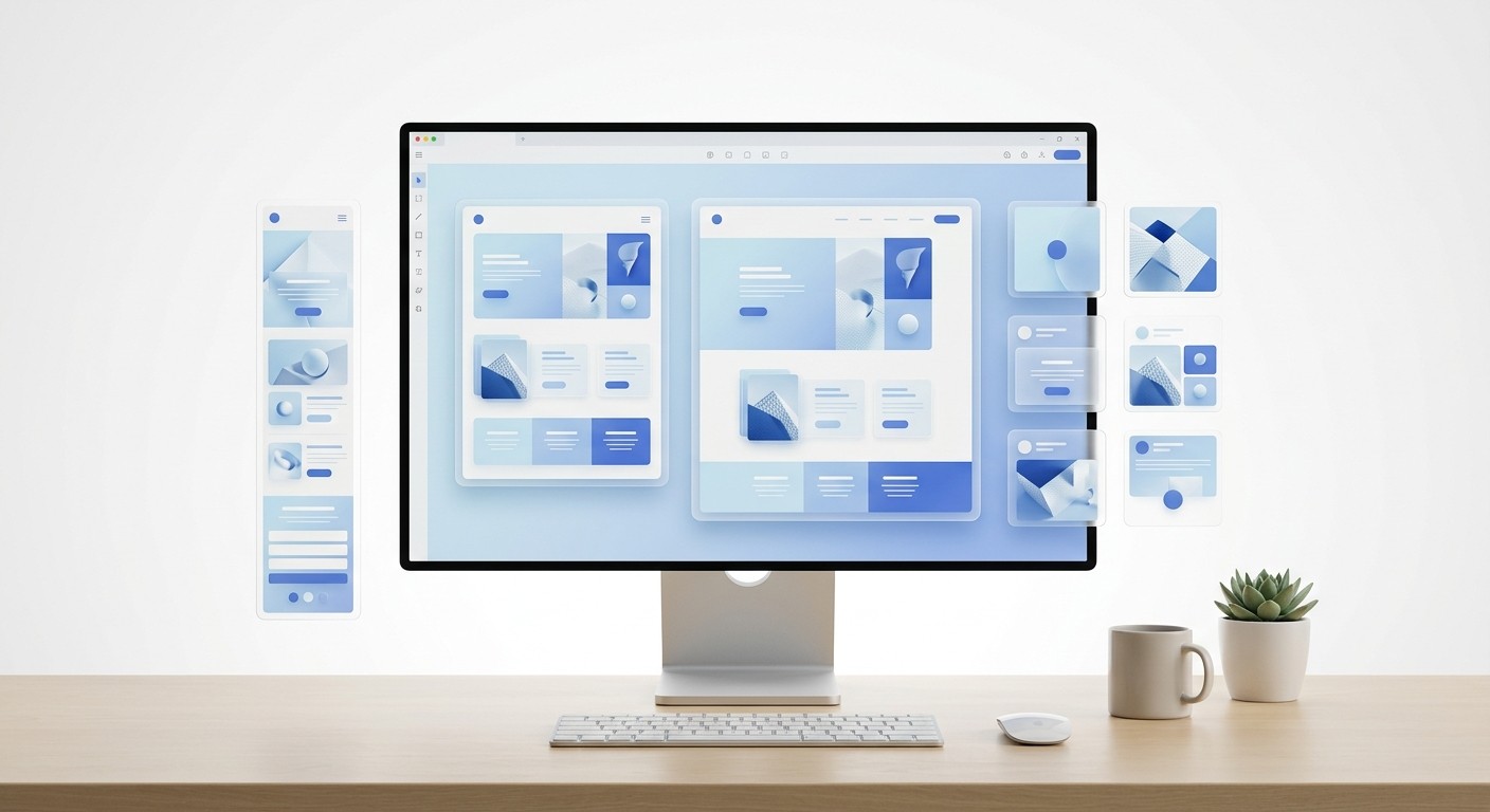
A saas landing page graphics figma setup is a centralized design system linking your website mockups directly to your social media assets. This visual consistency builds immediate trust when a prospect clicks from a LinkedIn carousel to your website. By standardizing these components, you eliminate friction, decrease bounce rates, and scale your content engine.
Designing high-performing saas landing page graphics figma assets requires more than artistic talent. It demands a systematic approach to visual communication. A landing page is simply an extended social media post designed to capture intent. When you treat your website graphics and your social content as separate entities, you break the psychological trust of your buyer. We use unified component libraries to ensure our brand looks identical across every channel.
Why do SaaS landing page graphics Figma setups matter for conversion?
The answer is trust. A SaaS landing page graphics Figma setup is a structured design workspace where website visuals and social media assets share the exact same component library. This unified approach prevents aesthetic mismatches that confuse buyers and ultimately degrade your overall conversion metrics.
Buyers judge software by its cover. When your digital storefront looks amateurish, prospects assume your actual product code is equally messy.
The median conversion rate for SaaS landing pages currently sits at a remarkably low 3.8%, which trails significantly behind the global cross-industry average of 6.6% (Unbounce, 2024). Software companies face a steeper challenge because they sell invisible products. Prospects cannot hold a subscription plan in their hands, so they rely entirely on the visual presentation to assess quality and trustworthiness. Building your SaaS landing page graphics in Figma provides a distinct structural advantage here. Teams can establish a centralized design system that links website mockups directly to social media assets. This guarantees that the exact typography, color hex codes, and spacing rules presented on LinkedIn are mirrored on the checkout page. When prospects experience this unbroken visual chain, their perception of risk decreases. They immediately associate the clean, professional appearance with reliable software performance.
The psychology of visual risk
B2B software purchases carry high professional risk for the buyer. A clean, systematic design language signals operational maturity.
When companies ignore this psychological reality, they bleed marketing dollars. They spend heavily on Google Ads only to send traffic to a confusing, fragmented digital environment. Fixing your foundational design system stops this specific type of revenue leak.
Predictability: Consistent visuals imply a consistent product experience.
Authority: Premium graphics position your tool as an enterprise-grade solution.
Clarity: Standardized layouts help users parse complex technical information quickly.
What is a visual jolt and how does it kill trust?
A visual jolt is the psychological friction a user experiences when they click an advertisement and land on a webpage with a conflicting design style. This sudden aesthetic disconnect breaks immersion, triggering immediate skepticism and driving up bounce rates.
Your ad sets an expectation. Your landing page must fulfill it perfectly.
A visual jolt occurs when a prospect clicks an advertisement expecting one aesthetic experience and lands on a page that looks completely different. This disjointed transition causes immediate psychological friction. Research shows that users form opinions about the aesthetic appeal and perceived usability of a website in less than 50 milliseconds (Omniconvert, 2025). If your LinkedIn carousel features sharp, dark-mode gradients but your website uses flat, bright illustrations, users instantly question whether they clicked a malicious link. This hesitation translates directly into lost revenue. Maintaining strict visual consistency throughout paid platforms and landing pages prevents this drop-off. Colors, fonts, imagery, and tone must connect sequentially to feel like a natural continuation of a single story. A unified Figma workspace allows marketers to export identical visual assets for both platforms, completely eliminating the visual jolt and preserving user trust.
Measuring the disconnect
Design Element | Aligned Experience | Visual Jolt Experience |
|---|---|---|
Typography | Matching font families and weights | Serif on social, sans-serif on site |
Color Palette | Exact hex code synchronization | Clashing primary button colors |
Imagery Style | Consistent 3D renders | Stock photos mixed with flat icons |
Mismatching these elements forces the user to reorient themselves. You want their cognitive energy spent on reading your copy, not processing your layout.
A consistent brand narrative reassures the prospect that the company is stable and detail-oriented. If a team cannot manage their own digital presence, buyers assume their software will be equally buggy and frustrating to operate.
How do you design scalable hero section design figma assets?
The answer starts with modular grids. A hero section design figma file is the primary visual block at the top of your webpage. Designing it for scalability means building flexible auto-layout containers that can swap background images and text without breaking constraints.
First impressions dictate the entire session duration. You must balance visual weight with technical performance.
The hero section is the primary driver for both first impressions and bounce rates, making it the most heavily scrutinized real estate on any website. Performance testing reveals that for every 100KB of additional weight in hero section assets, bounce rates increase by an average of 1.8% (Stellar, 2024). This creates a difficult balancing act for marketers who want visually impressive headers without sacrificing speed. Designers must export hero section graphics from Figma using optimized, next-generation formats like WebP or SVG rather than bloated PNG files. A clean, fast-loading hero section communicates value instantly while keeping the Largest Contentful Paint metric well within acceptable thresholds. When you prioritize performance alongside aesthetics, you retain the impatient visitors who would otherwise leave before scrolling. Speed combined with clear messaging ultimately dictates the success of your entire conversion funnel.
Structuring the master frame
Create a desktop frame at 1440 pixels wide to establish a standard baseline.
Apply a 12-column layout grid to guide text and image placement systematically.
Wrap the headline, subheadline, and call-to-action button in a vertical auto-layout container.
Lock the image aspect ratio so it resizes proportionately on smaller screens.
Remember to test this configuration extensively across different viewport sizes. A hero image that looks perfect on a desktop monitor often crops awkwardly on a mobile device, obscuring vital parts of your interface.
What are the best practices for B2B website mockups?
High-fidelity b2b website mockups are detailed visual representations of your software interface placed inside realistic device frames. The best practice is to display actual product workflows rather than abstract illustrations, providing immediate visual proof of your tool's capabilities.
Founders often hide their actual product behind vague vector art. Buyers want to see exactly what they are paying for before they book a call.
Adding contextual graphics and relevant video content to a digital storefront can increase landing page conversions by up to 86% (Eminence, 2026). In the B2B sector, potential buyers need to understand complex workflows quickly without reading dense technical documentation. High-fidelity website mockups fulfill this exact purpose by framing abstract software features inside familiar environments, such as browser windows or mobile device frames. When designers export these mockups directly from Figma, they provide immediate visual proof that the software actually exists and functions as advertised. Buyers project themselves using the tool when they see realistic interfaces populated with recognizable data. This visual evidence shortcuts the decision-making process. Providing a clear look at the dashboard builds credibility and removes the ambiguity that typically stalls B2B purchasing decisions, pushing prospects toward booking a demo.
Populating realistic data
Do not use placeholder text in your UI graphics. Dummy data immediately signals that the product is a prototype rather than a mature application.
Replace generic names with realistic industry personas.
Use plausible numerical data that reflects a successful user outcome.
Highlight specific UI elements, like a success notification or a high-value metric.
Every numerical value should tell a specific story of growth or efficiency. When prospects see a dashboard displaying a 45% reduction in support tickets, they immediately understand the direct value of adopting your platform.
Building modular product feature graphics in auto-layout.
Modular product feature graphics are self-contained design components that illustrate specific software capabilities. Auto-layout in Figma is a powerful formatting feature that forces these components to resize automatically as you change text or swap internal icons.
Manual resizing wastes hours of valuable design time. Smart components handle the math for you. When we build our social media carousel templates, we rely entirely on auto-layout so users can replace text without breaking the visual hierarchy.
Figma currently dominates the design software market with a commanding 40.65% market share, making it the industry standard for product design teams worldwide (Cropink, 2026). Because so many companies use this platform, standardizing your product feature graphics inside it ensures long-term scalability. By using auto-layout properties, designers create smart components that automatically expand or shrink based on the text you type inside them. This eliminates the tedious process of manually realigning pixels every time marketing updates a headline. When your graphics adapt dynamically to content changes, your team can generate dozens of localized landing page variants in minutes. This modular approach protects the integrity of your visual identity while dramatically accelerating your campaign launch speed. Rapid iteration becomes possible without ever compromising the premium quality of your visual assets.
Component variant strategies
Variants allow you to group related design assets into a single searchable item. You can switch a feature graphic from light mode to dark mode with a single toggle.
Design the base feature card with a title, description, and icon.
Turn the frame into a master component.
Add properties for different states, such as desktop size versus mobile size.
Testing your components under extreme conditions prevents future layout breaks. Try typing an exceptionally long German compound word into your newly created button variant to ensure the padding scales without overlapping adjacent icons.
How do you optimize landing page UI assets for load speed?
You optimize landing page ui assets by exporting them in compressed, modern file formats and stripping unnecessary metadata. Fast-loading graphics ensure your site passes Core Web Vitals assessments while keeping impatient users engaged with your content.
Beautiful graphics hold zero value if they refuse to load. Speed is a direct conversion lever.
Mobile users dominate internet traffic today, accounting for 82.9% of all landing page visits across industries (Eminence, 2026). Despite this overwhelming majority, many software companies still export massive, unoptimized UI assets that cripple mobile performance. Data indicates that 53% of mobile users will abandon a site completely if it takes longer than three seconds to load (Omniconvert, 2025). You cannot afford to lose half of your paid traffic simply because your interface graphics carry unnecessary metadata. Designers must apply export settings in Figma that prioritize lightweight delivery. Transitioning from traditional raster formats to scalable vector graphics or highly compressed WebP files drastically reduces total page weight. When your visual assets load instantly on 5G networks, visitors experience a fluid browsing session that keeps their attention focused strictly on your core value proposition.
Selecting the right format
File Format | Best Use Case | Performance Impact |
|---|---|---|
SVG | Logos, icons, simple UI shapes | Extremely lightweight, scales infinitely |
WebP | Photographs, complex dashboard mockups | High compression, excellent quality retention |
PNG | Images requiring transparent backgrounds | Heavy, use only when strictly necessary |
Avoid JPEG files for interface graphics entirely. They introduce compression artifacts that make typography and sharp UI borders look muddy and unprofessional.
Image compression represents the lowest-hanging fruit in technical optimization. Running your exports through dedicated compression algorithms ensures maximum quality retention at a fraction of the original file size.
Repurposing Figma web design assets for LinkedIn carousels.
You repurpose figma web design assets by dropping them into pre-formatted 4:5 aspect ratio frames optimized for social feeds. A LinkedIn carousel is simply a landing page sliced into multiple digestible slides, sharing the exact same narrative flow.
Content creation should never start from scratch. Your website already contains your highest-performing arguments.
Top-performing landing pages do not exist in a vacuum; they are the final destination of a larger marketing narrative that usually begins on social media. Companies that implement 10 to 15 optimized landing pages can increase their conversion rates by 55% (Databox, 2026). Scaling your page volume requires a highly efficient asset pipeline. You can meet this demand by repurposing your core web design graphics into bite-sized content blocks for platforms like LinkedIn. The high-contrast UI snippets that explain your software on a website perform exceptionally well as swipeable carousel slides. Because you are pulling these assets from the same master file, your audience receives a completely unified brand experience. This dual-purpose strategy maximizes the return on your design investment while ensuring your multi-channel marketing campaigns feel completely cohesive.
Slicing the narrative
Think of each landing page section as an independent slide. The progression must logically guide the reader from the problem to your solution.
Slide 1: The hero headline addressing the core pain point.
Slide 2-4: Visual evidence highlighting the failure of traditional methods.
Slide 5-7: Product feature graphics showing the new workflow.
Slide 8: The exact call-to-action button used on your website.
This format trains your audience to expect high-value insights wrapped in premium packaging. When they eventually click through to the main site, the recognizable visual environment dramatically lowers their natural resistance to signing up.
What is the fastest way to maintain brand consistency?
The fastest method is using design tokens. Design tokens are indivisible pieces of your visual system, like specific hex codes or font spacing rules, stored as reusable styles in your master library to guarantee uniformity across all outputs.
Manual checks lead to human error. Automation protects your brand identity at scale.
Establishing a strong visual identity requires strict adherence to predefined design rules across every single customer touchpoint. Implementing human faces and relatable emotional cues in the hero section is a common tactic, as 73% of landing pages use human imagery to grab attention (VWO, 2025). However, even the best photography fails if the surrounding brand colors and typography look disjointed. Setting up centralized libraries inside Figma enforces this necessary discipline automatically. When a lead designer updates a primary button color from royal blue to navy, that change propagates instantly through every connected mockup and social media template. This synchronization completely eliminates the risk of outdated assets slipping into active campaigns. Buyers learn to recognize your specific visual signature quickly, which accelerates the trust-building process and ultimately lowers your customer acquisition costs over time.
Managing published libraries
Keep your core branding elements in a separate file. Publish this file as a library so your entire marketing team can access the approved tokens.
Define primary, secondary, and error colors globally.
Set specific typography styles for H1, H2, and body copy.
Create a unified shadow style to ensure realistic depth across all UI elements.
Design systems require continuous maintenance as your platform evolves. Schedule monthly reviews to prune unused components and update existing assets based on fresh performance data.
Mastering your saas landing page graphics figma pipeline transforms marketing from a bottleneck into an accelerator. Clean execution builds the trust necessary to close enterprise deals.
References
Conversion Benchmark Report. Unbounce, 2024.
Hero Section Optimization: Best Practices and Examples. Omniconvert, 2025.
High-Impact Hero Sections That Don't Hurt Page Speed. Stellar, 2024.
How to Build a Landing Page That Converts in 2026. Eminence, 2026.
40+ Figma Statistics Designers Wish They Knew Before. Cropink, 2026.
B2B SaaS Landing Page Statistics & Benchmarks. Databox, 2026.
40+ Must-Know Landing Page Statistics to Boost Conversions. VWO, 2025.
Landing Page Secrets for Better ROI: Conversion, UX & Optimisation. ASP Events, 2025.


