How to Create Accessible Social Media Color Palettes for B2B
Want higher B2B engagement? Accessible social media color palettes fix readability for 300 million color-blind users. Learn how to test contrast in Figma.
Accessible social media color palettes are defined sets of brand colors that meet Web Content Accessibility Guidelines (WCAG) contrast ratios, ensuring text remains readable for all users. We implement these palettes because 83.1% of digital content currently fails basic contrast standards, actively alienating audiences. Fixing this immediately improves content reach and readability for B2B marketing teams.
What are accessible social media color palettes?
Accessible social media color palettes are curated color combinations that maintain a strict mathematical contrast ratio between foreground text and background elements. These palettes ensure that text remains highly legible across different screens, harsh lighting conditions, and varying human vision capabilities. They rely entirely on objective WCAG metrics rather than subjective aesthetic preferences.
The foundation of these palettes is the contrast ratio. The Web Content Accessibility Guidelines dictate a minimum contrast ratio of 4.5:1 for normal text and 3:1 for large text to achieve AA compliance. Designing without these constraints creates massive usability barriers. Currently, low-contrast text is the most common accessibility failure across digital platforms, affecting 83.9% of homepages (WebAIM, 2026).
When we build templates for our clients, we map out specific background and typography combinations that strictly adhere to these AA or AAA standards. This systematic approach guarantees that carousels and static posts remain readable when users scroll quickly on mobile devices or view screens in direct sunlight. High contrast B2B design eliminates the friction that causes users to abandon content. You replace unreadable visual noise with clear, scannable information that converts.
Here is how WCAG standards break down for digital text readability:
Compliance Level | Text Size | Required Ratio | Status |
|---|---|---|---|
AA | Normal (Under 18pt) | 4.5:1 | Minimum Standard |
AA | Large (18pt+) | 3.0:1 | Minimum Standard |
AAA | Normal (Under 18pt) | 7.0:1 | Maximum Readability |
Why does high contrast B2B design drive higher engagement?
High contrast B2B design is a functional requirement that directly increases content readability, retention, and click-through rates. By eliminating visual strain, clear color combinations keep professional audiences engaged with complex educational content. High contrast reduces cognitive load so buyers process information faster.
Professional audiences process vast amounts of information daily, making fast comprehension a competitive advantage. When digital assets lack adequate contrast, readers simply scroll past them. Over 5.35 billion people actively use social media platforms, and accessibility features like readable fonts help millions participate online (Tenet UI UX, 2025). We see companies invest heavily in copywriting while burying their message in low-contrast grays and pastels. This oversight directly impacts business outcomes.
Core web usability metrics show that pages meeting basic readability and interaction standards experience a 24% reduction in abandonment rates (Wise Owl Marketing, 2025). A high-contrast approach forces designers to simplify visual hierarchies. You stop relying on subtle shading and start using distinct values to guide the user's eye toward key data points. The result is a sharp, authoritative brand presence that signals competence to enterprise buyers and startup founders.
How do you adapt for color blindness social media users?
Optimizing for color blindness social media audiences is the process of modifying brand assets so they remain legible to users with specific color vision deficiencies. We achieve this by adding secondary visual indicators and ensuring a sufficient lightness difference exists between overlapping brand colors. This guarantees universal accessibility.
Designing for vision deficiency requires looking beyond hue and focusing heavily on value and saturation. Approximately 8% of men and 0.5% of women worldwide are color blind, translating to over 300 million people globally (Colorblind Smart, 2025). If your data visualizations rely entirely on red and green to distinguish between positive and negative metrics, you alienate a massive segment of your professional audience. Red-green color blindness accounts for 98% of all cases (ElectroIQ, 2025).
We fix this by introducing patterns, varied shapes, or direct text labels alongside color cues. To test our layouts, we simulate how they appear in grayscale. If a chart or carousel graphic loses its meaning without color, the design fails. Strong brand identity systems solve this by defining specific accessible pairs within the core palette that guarantee clear separation for any viewer.
What are the core social media accessibility best practices?
Social media accessibility best practices are standardized techniques that make content readable and navigable for audiences with varying visual, auditory, and cognitive abilities. These methods encompass proper color usage, semantic text formatting, closed captioning, and descriptive alternative text for all images.
Structuring content for inclusivity goes far beyond aesthetic color choices. It requires a rigid adherence to technical formatting standards. Right now, around 1.3 billion people live with a disability that affects how they use the internet (Tenet UI UX, 2025).
To support this audience, we implement strict rules for typographic hierarchy and layout spacing. Text must never be embedded in busy background images without a dark overlay to maintain readability. Missing alternative text remains a critical failure point, with 16.2% of all digital images completely lacking alt descriptions (WebAIM, 2026).
Every carousel slide should include explicit alt text that describes the data presented. We recommend using CamelCase for hashtags so screen readers parse the words correctly. Combining these structural tactics with high-contrast color pairings guarantees your marketing materials reach their maximum potential audience without technical friction.
Follow these specific steps to implement accessibility protocols across your content workflow:
Run every brand color combination through a digital contrast analyzer.
Add hard-coded contrast tokens into your primary design file variables.
Write descriptive alternative text for every informative image.
Apply camel case formatting to all promotional hashtags.
Ensure graphical charts include textual data labels.
How do you choose web safe colors for marketing?
Web safe colors for marketing are specific hexadecimal codes selected because they render consistently across all mobile devices, operating systems, and monitors while maintaining required contrast ratios. Choosing them involves mapping brand hues to their closest accessible equivalents using standardized testing tools.
The concept of web-safe palettes has evolved from early computer graphics to focus entirely on cross-device consistency and accessibility compliance. Many marketing teams inherit brand guidelines designed primarily for print. These guidelines routinely fail in digital environments. As of early 2025, 62.73% of all digital traffic was accessed through mobile phones (Forbes, 2026).
Screen glare and variable brightness settings on these smaller devices easily destroy subtle color differences. We extract the core dominant color from a client's brand and test it against pure white and dark gray backgrounds. If the primary brand color fails the WCAG 4.5:1 ratio, we create a darkened digital variant specifically for typography.
We then reserve the original lighter brand color for large decorative elements or thick UI borders. This compromise keeps the brand identity intact while ensuring all educational text meets strict digital readability benchmarks.
When transitioning print guidelines to digital spaces, marketers face several distinct issues:
Print colors rely on CMYK models that often lack exact digital hex equivalents.
Light pastels look clean on paper but wash out completely on backlit screens.
Thin typography weights fail to render sharply on mobile displays.
Brand guidelines rarely specify rules for dark mode environments.
How do you test palettes with a contrast checker Figma plugin?
A contrast checker Figma plugin is a digital utility that calculates the exact luminosity ratio between selected text and background layers directly inside the design workspace. We use these plugins to validate our typography choices in real-time before exporting any social media graphics.
Automating accessibility checks directly within the design software prevents costly revisions later in the marketing pipeline. We integrate external plugins into our daily workflow to evaluate text layers against their parent frames instantly. Modern digital design requires continuous validation.
When designers break their flow to check external contrast websites, compliance drops significantly. Adding contrast data directly into the Figma UI helps teams follow guidelines while staying in their design flow (Thoughtbot, 2025). To execute this, you select your text layer and background frame simultaneously, run the plugin, and review the AA or AAA score.
If the combination fails, you adjust the hex code's lightness slider inside the application until the plugin confirms compliance. This rapid iteration cycle guarantees every template shipped meets rigorous accessibility standards without slowing down production.
Setting up inclusive design marketing systems
Inclusive design marketing is the operational framework of building templates, brand kits, and content workflows that prioritize accessibility from the ground up. This system shifts compliance from an afterthought to a baseline requirement embedded directly into your master design files.
Scaling social media output requires locked constraints. When multiple team members create content, giving them unrestricted access to a massive color wheel inevitably leads to accessibility failures. We solve this by pre-defining acceptable color pairs as local variables within our design software.
Building social media carousel posts requires an airtight system where background and text layers are rigidly linked to WCAG-compliant tokens. B2B businesses spanning many industries now treat accessibility as a top priority and a legal necessity (Clear Digital, 2025). By restricting designers to pre-tested, high-contrast pairs, we eliminate human error.
You establish a visual hierarchy where primary text always uses the highest contrast token, while secondary metadata uses a compliant but slightly muted variant. This approach standardizes your output. Your marketing department produces professional, readable assets at scale, reinforcing brand authority while respecting the diverse visual needs of your entire audience.
How do you document accessibility rules for your team?
Documenting accessibility rules is the process of creating a centralized brand guideline that clearly dictates which color pairs are permissible for public content. We use dedicated design system files to store these rules so every marketer references the exact same standardized logic.
Without clear documentation, accessibility initiatives break down quickly during rapid content production. Teams often forget which hex codes pass contrast tests when rushing to publish a daily post. A poorly documented system guarantees visual inconsistency. Color-consistent branding increases revenue by up to 23% because it builds trust and recognition (Scalify.ai, 2026).
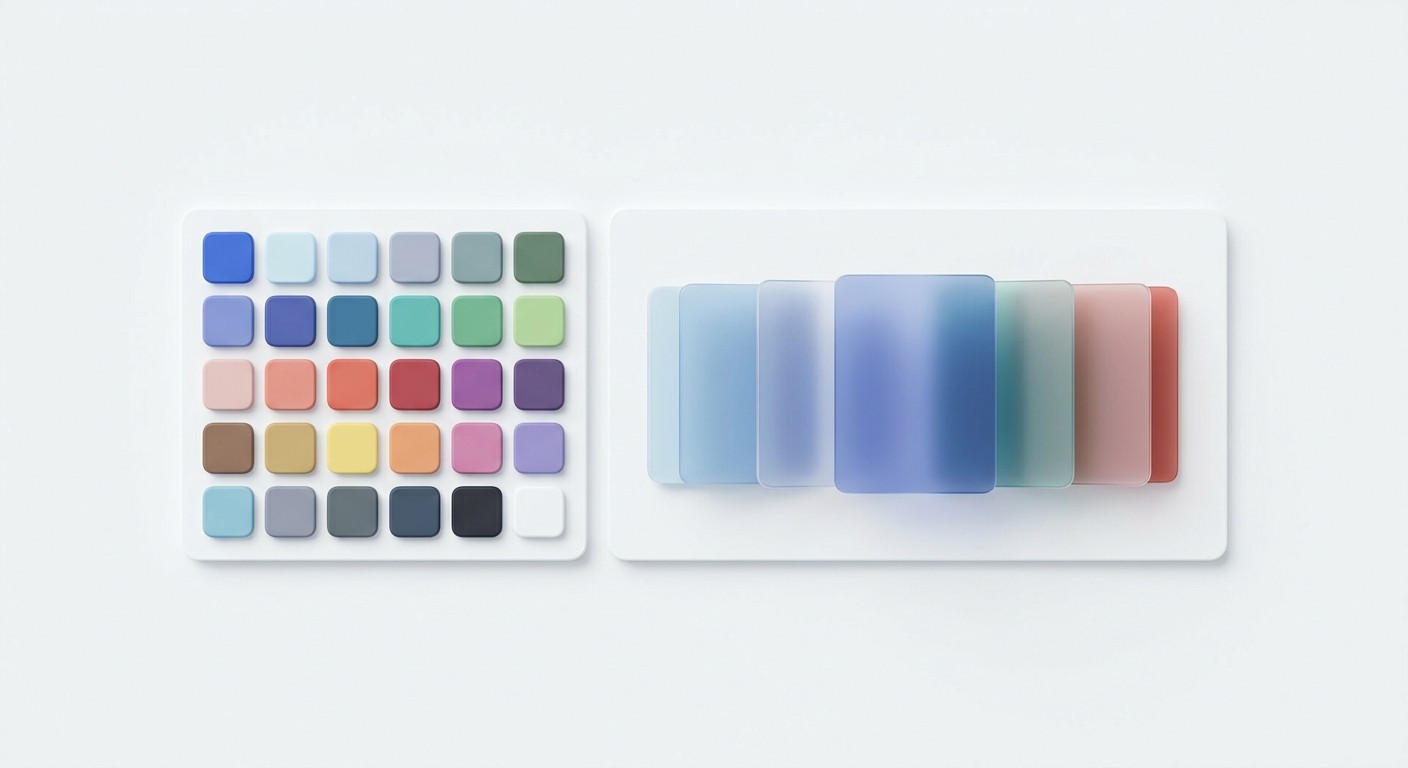
We require our teams to map out every approved combination visually in a grid format. You list your primary colors on one axis and background shades on the other. Each intersecting square gets a clear pass or fail label based on WCAG standards.
This simple visual matrix removes all guesswork from the creative process. Junior designers immediately know exactly which tones to use when assembling accessible social media color palettes without needing to run a manual check on every individual text layer.
References
Global statistics on color blindness. Colorblind Smart, 2025.
The WebAIM Million. WebAIM, 2026.
Important Web Accessibility Statistics to Know. Tenet UI UX, 2025.
WCAG Accessible Website Colors. Wise Owl Marketing, 2025.
Color Blindness Statistics By Demographics. ElectroIQ, 2025.
Top Website Statistics for 2025. Forbes, 2026.
Keep track of color contrast in Figma with our plugin. Thoughtbot, 2025.
Keep Your Eye on These 4 B2B Website Design Trends. Clear Digital, 2025.
Website Color Psychology Statistics. Scalify.ai, 2026.


