How to Maintain Brand Consistency on Social Media With Figma
Discover how to maintain brand consistency on social media using Figma components. Secure your visual identity, speed up workflows, and build trust today.
Maintaining brand consistency on social media requires locking down your visual assets into a centralized design system that anyone on your team can use without breaking the rules. By building strict templates and component libraries in Figma, you prevent the fragmented brand effect that happens when multiple non-designers touch the accounts. This approach guarantees that every post looks like it belongs to your company, instantly building trust and driving higher engagement.
What is brand consistency on social media?
Brand consistency on social media is the practice of maintaining a uniform visual identity, tone of voice, and messaging strategy across every platform your company uses. This means applying the exact same color palettes, typography, spacing rules, and logo usage whether you publish a quick text update, a short-form video, or a detailed educational carousel.
Why does this matter for the bottom line? A cohesive presence signals professionalism and reliability, which directly impacts consumer trust. When users see a fragmented identity, they subconsciously assume the product itself is disorganized.
In fact, companies that maintain consistent brand presentation across all platforms report revenue increases between 23% and 33% (Shout Out Studio, 2026). This financial uplift occurs because uniform design reduces cognitive load for the buyer, making your content instantly recognizable in a crowded feed. Beyond that, establishing brand consistency on social media prevents wasted ad spend.
Inconsistent brands often need to spend up to 1.75 times more on media to achieve the same growth as their uniform competitors (Marketing LTB, 2025). Locking down your visual rules is not just a cosmetic exercise for the design department; it is a critical revenue driver that dictates how efficiently your marketing budget converts attention into actual pipeline.
Consistency builds a mental shortcut for your audience. A consumer needs to see a brand an average of five to seven times before they actually remember it. If those seven touchpoints look entirely different, you are resetting the memory clock every single time you post.
Why does consistent visual branding break down as startups scale?
Consistent visual branding breaks down because scaling startups transition from a single dedicated designer to multiple team members creating content in silos. As the demand for daily posts increases, founders, marketers, and social managers start improvising with different tools and local files, leading to a disconnected identity.
We regularly see early-stage companies launch with a pristine website and a beautifully crafted logo. Fast forward six months, and their Twitter feed looks completely disconnected from their Instagram grid. This drift happens gradually.
A marketer needs a graphic immediately, so they pull a random hex code that looks close enough to the brand blue. A founder creates a quick text graphic but uses an unapproved default font instead of the official corporate typeface. A sales rep downloads a low-resolution logo from Google Images because they cannot locate the official vector file on the company drive.
These isolated decisions compound quickly. Within a few months, your corporate profile resembles a patchwork quilt of competing design philosophies.
To stop this leak, you need more than a simple PDF manual outlining your rules. You need operational guardrails integrated directly into the tools your team uses daily. While 95% of organizations have formal design manuals, only 30% actually use them regularly (Lucidpress, 2025).
The disconnect stems from poor accessibility. If your rules live in an external document rather than directly inside the creation software, people will inevitably ignore them under the intense pressure of tight publishing deadlines.
How do you define your core visual elements before designing?
Defining your core visual elements involves auditing your current assets and selecting a strict, limited set of colors, fonts, and shapes that will represent your company online. Before you even open your design software, you must decide exactly what constraints will govern your daily output. You cannot enforce rules if those rules do not exist clearly in the first place.
Start by auditing your most successful past content. Look at the organic posts that generated the highest engagement and note the specific visual patterns present in those graphics. Did they use high-contrast text against dark backgrounds?
Did they feature specific geometric shapes, hard shadows, or organic illustrations? Lock these decisions down into a documented framework that leaves zero room for subjective interpretation.
Next, restrict your color palette ruthlessly. You do not need twenty different shades for daily social media graphics. You need one primary recognizable color, two secondary accents for emphasis, and a reliable set of neutral backgrounds.
The goal is rapid, subconscious recognition. When a user scrolls past your graphic at high speed on their mobile device, that primary color should instantly trigger brand recall.
Typography requires the exact same ruthless limitation. Select one highly legible typeface for your massive headlines and a secondary, simple sans-serif font for your body copy. Never use more than two font families in a single graphic. The more variables you introduce to the system, the harder it becomes to maintain control as your team expands.
How do you set up social media brand guidelines in Figma?
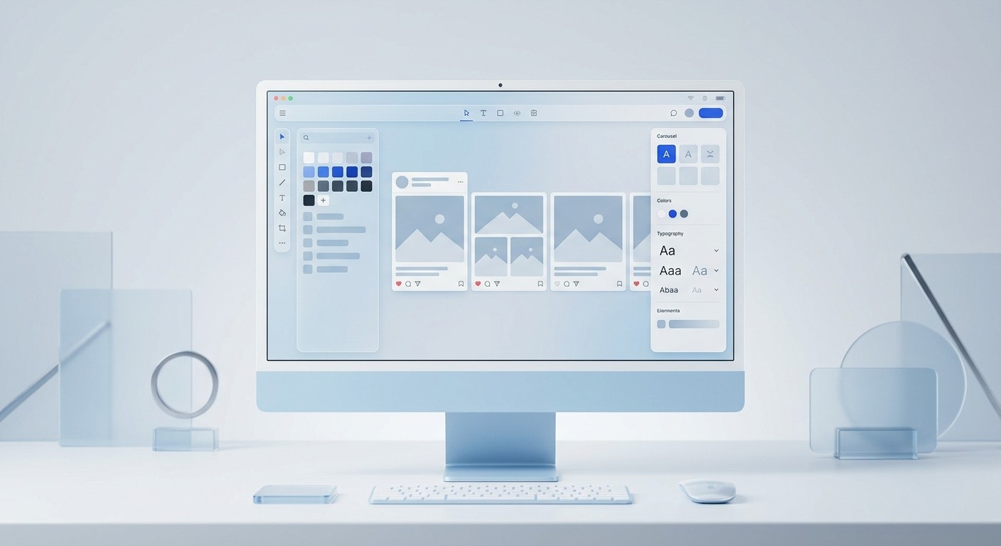
Social media brand guidelines in Figma are digital rulebooks embedded directly into your design environment using local variables and text styles. Instead of relying on a static external document, you store your exact color codes, typography scales, and spacing rules as reusable tokens that automatically apply to every new canvas.
Creating this system requires translating your brand book into native software properties. Start by defining your color variables. Create specific semantic tokens for primary actions, secondary highlights, success states, and neutral surfaces.
Naming conventions matter here. Name a color "Brand/Primary" rather than "Blue" so the team knows exactly how to apply it.
Next, lock in your typography styles. Define exact font families, text weights, and line heights for every possible text layer. You should have predefined styles for H1 covers, H2 slide titles, body copy, and small footnotes.
Auto-layout in Figma is a feature that lets components resize dynamically based on their content. We recommend using auto-layout for all standardized containers. When you apply auto-layout to a text card, the padding remains identical whether a copywriter types three words or three full sentences.
Figma currently commands an 82.3% market share among interface design tools, making it the industry standard for building these scalable systems (LogRocket, 2025). Centralizing your rules here ensures that anyone drafting a post starts with completely compliant foundations.
Securing your figma brand assets for non-designers
Securing your figma brand assets involves using component properties and locked layers to restrict what non-designers can alter on the canvas. By converting your standard layouts into rigid master components, you allow marketers to edit text and swap background images while preventing them from accidentally moving logos, changing core structural elements, or deleting vital layout constraints.
We find that template-based systems dramatically reduce revision cycles because changes propagate through components automatically. If you want to update a primary button color across fifty different social graphics, you no longer have to edit fifty separate files. You only change the master component.
The update instantly cascades to every single instance in your active file, saving hours of tedious manual adjustment. To execute this properly, separate your workspace into a protected library file and a daily execution file.
The library houses the master components and requires strict admin access to alter. The execution file is where the marketing team drags those pre-built components to draft daily posts.
If your team lacks the internal resources to build these complex component libraries from scratch, adopting a Figma-based design template provides an immediate, locked-down framework without the overhead of hiring an agency. This gives you a massive operational head start.
Figma's variable system also allows you to restrict color choices intentionally. When a social media manager clicks on a background layer to change it, they should only see the approved brand palette, not the entire unrestricted color spectrum.
This intentional friction protects the company identity. You are effectively making it harder to do the wrong thing than it is to do the right thing. Strict component architecture eliminates the overwhelming anxiety of handing over the design keys to individuals without formal graphic training.
How do you build an omni channel marketing design system?
An omni channel marketing design system is a synchronized framework that adapts your core visual identity to fit the unique dimensional constraints of every social platform. It ensures that a square graphic optimized for Instagram carries the exact same aesthetic DNA as a landscape link preview on Facebook.
Omni channel marketing design requires anticipating how different networks crop and display content. A square post requires different safe zones than a vertical video thumbnail. Instead of redesigning the exact same asset four times from scratch, build responsive base components.
Using nested auto-layout rules and constraint properties, you can create a single master graphic that reflows automatically when placed into different aspect ratio frames. This means your core message, logo placement, and branded elements remain intact regardless of the final output format.
Here are the standard aspect ratios you must account for in your master files:
Platform | Format Type | Aspect Ratio | Dimensions |
|---|---|---|---|
Instagram & Facebook | Standard Feed Post | 4:5 or 1:1 | 1080x1350 or 1080x1080 |
LinkedIn & X | Carousels & Links | 4:5 or 16:9 | 1080x1350 or 1200x675 |
TikTok & YouTube | Vertical Video | 9:16 | 1080x1920 |
Standard Pin | 2:3 | 1000x1500 |
By establishing these specific frames as locked templates in your workspace, you guarantee that no vital text gets cut off by a platform's native user interface elements. This pre-planning prevents the amateur look of cropped headlines on your public feeds.
What are the biggest typography mistakes on social media?
The biggest typography mistakes on social media involve using highly decorative fonts that destroy legibility on small mobile screens. Many brands also fail to maintain adequate contrast between their text layers and the background imagery, making their content impossible to read for users scrolling quickly in bright environments.
Readability must always override aesthetic cleverness. When you design a graphic on a massive 27-inch desktop monitor, a thin script font might look elegant. When that same graphic shrinks down to a 6-inch mobile screen, that thin font becomes an illegible blur.
To avoid this, establish strict minimum font sizes in your brand system. We recommend never dropping below 32 pixels for any body copy intended for a mobile feed. Your main headlines should be significantly larger, utilizing heavy font weights to create immediate visual hierarchy.
Contrast is equally important. Always test your text against background colors using an accessibility checker. If you overlay text onto a photograph, apply a dark gradient or a solid color block behind the words to ensure they remain legible regardless of the image underneath.
Predictable text placement trains your audience on where to look, speeding up their consumption of your content. By standardizing these typographic rules, you guarantee professional output every single time.
Rules for marketing team collaboration in design files
Marketing team collaboration inside design software requires strict file organization, clear naming conventions, and defined permission levels to prevent absolute chaos. When copywriters, social managers, and designers work in the same file simultaneously, establishing clear workflows ensures that draft content never accidentally gets exported and published to your live audience.
To maintain brand consistency on social media, you must govern exactly how your team interacts with the digital canvas. Give your core designers full edit access to the master library file, but restrict the broader marketing team to view-only access for those specific components.
They can pull instances into their own drafting files without the risk of overwriting the core rules that keep your visual identity intact. Implement a strict staging system using distinct pages within your document.
Create separate areas labeled for Drafts, In Review, and Ready for Export. This visual pipeline eliminates any confusion about what the marketing director has approved for scheduling. You can even use text-based status indicators in the page titles to signal progress clearly to everyone logging in.
Communication should also happen directly on the canvas, not in external chat apps. Encourage the team to use the built-in comment tool to request copy tweaks, ask questions about spacing, or flag image replacements.
This keeps the feedback highly contextual and avoids messy email chains where critical details get lost. Cross-functional adoption of these tools is accelerating rapidly, with 85% of design leadership roles now integrating advanced collaborative features to unblock their individual contributors (LogRocket, 2025).
When you treat your design file as a living project management board, execution speed increases exponentially. Your marketing cycles shorten dramatically because everyone operates from a unified source of truth.
How do you maximize your brand identity on linkedin with carousels?
Maximizing your brand identity on linkedin requires utilizing multi-image carousels built with highly consistent typography, stark color contrasts, and repeating structural elements. Because this platform prioritizes educational, swipeable content, maintaining a steady visual rhythm from the first slide to the last keeps readers engaged and reinforces your professional authority.
LinkedIn has evolved from a simple networking site into a high-velocity content distribution engine. The algorithm heavily favors participatory, document-style formats over standard links. Multi-image carousels currently achieve an average engagement rate of 6.60%, establishing them as the highest-performing organic format on the entire platform (Postunreel, 2026).
Data shows these specific carousels generate 596% more engagement than standard text-only posts. If you want to capitalize on this massive organic reach, your slides cannot look like a random assortment of hastily assembled presentation graphics.
Your presentation needs to look premium and highly intentional. Follow these structural rules for high-converting educational slides:
The Hook Slide: Use your boldest brand color as the background. Keep the title under ten words, utilizing your heaviest typography weight. Include a recognizable profile picture or company logo in the top corner to establish immediate authority.
The Value Slides: Switch to a high-contrast neutral background, like white or soft gray, to reduce eye strain during extended reading. Keep the body copy tightly aligned. Add a subtle progress bar or slide counter at the bottom so the reader knows exactly how far they have swiped.
The Call-to-Action Slide: Return to the bold color used on the cover. Clearly instruct the reader on the exact next step, whether that is subscribing to a specialized newsletter or leaving a specific comment below the post.
When you templatize this exact document flow in Figma, your marketing manager can generate a highly engaging, perfectly formatted carousel in minutes just by swapping the text layers. This specific workflow bridges the gap between high design standards and high-volume content demands.
How do you measure the ROI of strict design governance?
You measure the ROI of strict design governance by tracking the reduction in asset creation time, the decrease in external freelance costs, and the overall improvement in social media engagement metrics. When a brand implements tight component systems, the primary financial return comes from operational velocity and increased output volume.
Before implementing a system, designing a daily social post might take forty-five minutes of tweaking layouts, hunting for the right hex codes, and fixing broken alignments. After implementing locked components, that exact same task drops to five minutes of simple text entry. You are eliminating the friction of micro-decisions completely.
Externally, the metrics are equally clear. Consistent presentation builds trust, and trust drives conversions. When your audience instantly recognizes your graphics in their feed, your click-through rates improve organically.
You spend less money trying to re-introduce your company to the same prospects. Ultimately, enforcing brand consistency on social media transforms your design operations from a frustrating bottleneck into a scalable growth engine.
By utilizing Figma to enforce these rules structurally, you equip your entire team to move incredibly fast without ever compromising the premium quality of your output. The result is a marketing machine that looks established, authoritative, and relentlessly professional.
References
Brand Consistency Is Worth 33% More Revenue. Shout Out Studio, 2026.
Branding Statistics 2026: 98+ Stats & Insights. Marketing LTB, 2025.
The Impact of Brand Consistency. Lucidpress, 2025.
Surprises and trends from this year's Design Tools Survey results. LogRocket, 2025.
LinkedIn Carousel Engagement 2026 Data & 6.60% Benchmark. Postunreel, 2026.


