How to Master Podcast Cover Design Figma Workflows in 2026
Master your podcast cover design figma workflow to stand out on Spotify and Apple. Learn to build scalable, high-converting artwork that drives mobile clicks.
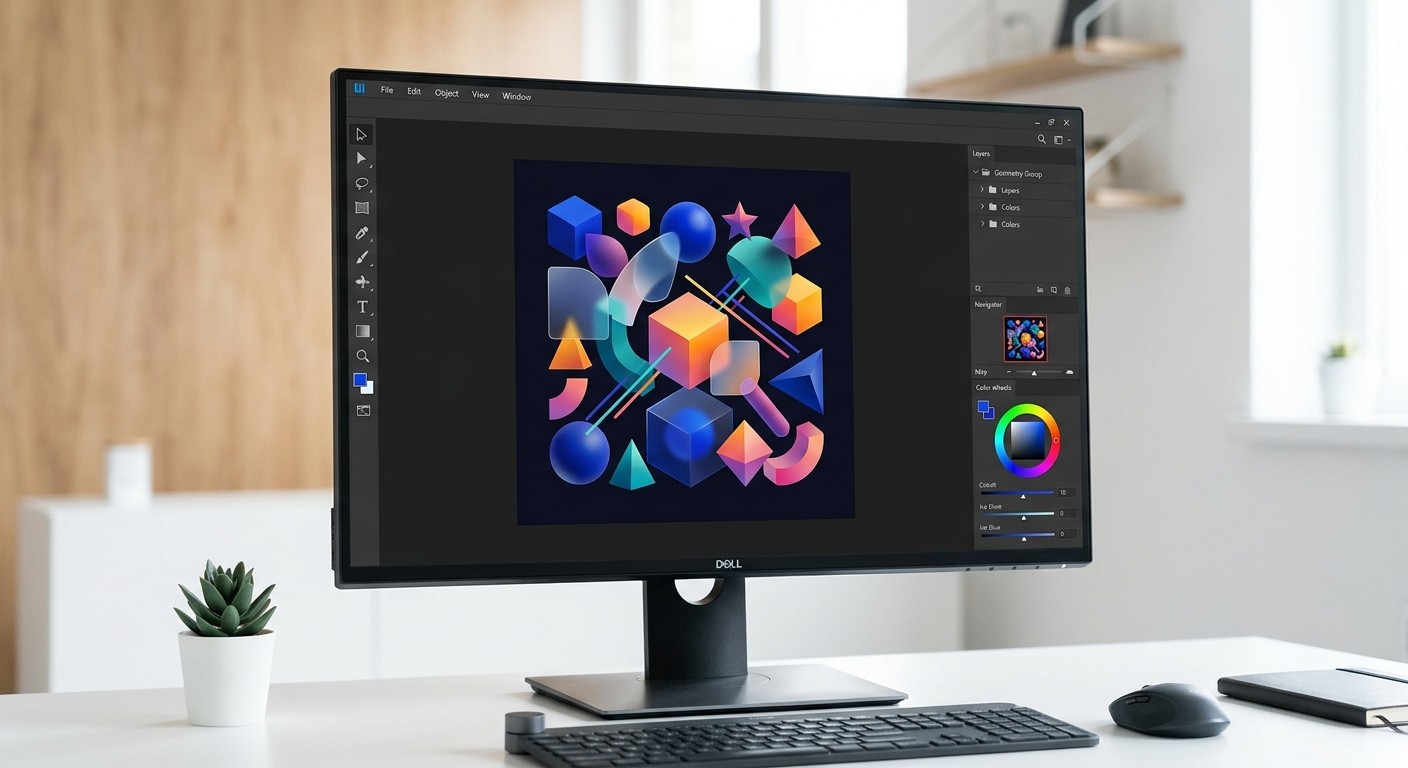
A podcast cover design figma workflow relies on structured grids, auto-layout, and high-contrast typography to build artwork that converts listeners on mobile screens. By standardizing your design system, you bypass tedious manual adjustments and ensure your show visually dominates crowded directories like Spotify and Apple. Mastering this process scales your audio brand without requiring expensive freelance retainers.
Scaling a digital media presence requires extreme visual efficiency. Founders and agency owners cannot afford to spend hours wrestling with disorganized design files every time they publish a new episode. A systematic approach to your audio branding ensures you look like an established, premium company from day one. We see countless indie hackers launch incredible audio content, only to watch it fail because their promotional graphics look rushed. By building a bulletproof component library upfront, you reclaim your most valuable asset: time. You stop acting as a graphic designer and return to your core role as a product builder and content creator.
What is a podcast cover design figma workflow?
A podcast cover design figma workflow is a structured process for building scalable, high-contrast audio artwork using component libraries and auto-layout. This approach ensures your visual assets remain perfectly legible whether they are displayed on a massive desktop monitor or compressed into a tiny thumbnail on a smartphone screen.
Mastering a component-driven architecture is critical because the vast majority of your audience will discover your show on a small screen. Mobile devices overwhelmingly dominate podcast listening, accounting for 87.4% of all consumption globally (DataGlobeHub, 2026). When a potential subscriber scrolls through their feed, your cover art is compressed into a tiny square that measures just 50 by 50 pixels. If your text is too thin, your contrast is too low, or your composition is too cluttered, that critical first impression is completely lost.
A proper design system solves this problem by allowing you to preview your artwork at multiple scales simultaneously. By using frames set to different display sizes, you can instantly verify that your typography remains legible and your core visual hook remains striking. Building this infrastructure upfront prevents the frustrating cycle of exporting, uploading, and realizing your art looks unreadable on an actual mobile device, saving you countless hours of tedious revision work over the lifespan of your audio content.
We find that establishing a strict hierarchy of elements eliminates the chaotic guesswork associated with blank canvases. When you map out specific zones for text, host portraits, and background textures, your visual output becomes remarkably predictable. You execute updates in seconds instead of hours.
Why do most creators fail at podcast artwork design?
Most creators fail at podcast artwork design because they treat the medium like a traditional print poster instead of a mobile software icon. They introduce complex illustrations and excessive text that completely vanish when the image is aggressively downscaled by streaming applications.
Standing out requires immense visual clarity because the audio market has become incredibly saturated with competing content. Spotify now hosts over 7 million podcast titles in its library as of early 2026 (SQ Magazine, 2026). When an indie creator uploads a new show, they are instantly placed next to massive media conglomerates with unlimited creative budgets. Most beginners attempt to compensate for this by cramming their cover art full of complex illustrations, long subheadings, and multiple photographs.
This is a fatal error. Complex artwork simply turns into an unrecognizable blur of pixels when scaled down inside a mobile application interface. The human eye cannot process elaborate details in a thumbnail measuring a fraction of an inch across.
To succeed in this environment, you must embrace absolute minimalism. A single bold focal point paired with maximum color contrast will always outperform a busy layout. By stripping away non-essential elements and focusing strictly on the core brand message, founders can ensure their show remains visually dominant in any directory.
Avoid these common structural mistakes when drafting your initial concepts:
Using more than four words in your main title graphic.
Selecting cursive, thin, or low-weight typefaces that lack immediate punch.
Placing critical visual information near the extreme edges of the canvas.
Applying dark text over dark backgrounds without an isolating drop shadow.
What are the exact apple podcast dimensions 2026?
The exact apple podcast dimensions 2026 require a perfect square canvas measuring exactly 3000 by 3000 pixels for successful ingestion. The final exported file must use the RGB color space, contain absolutely no transparent background layers, and weigh significantly less than 500 kilobytes upon submission.
Following platform specifications perfectly is non-negotiable if you want your show to be approved and distributed properly. Globally, there are currently 4.58 million podcasts available across major directories (Riverside, 2025). Apple handles a massive portion of this content, and their ingestion engine will automatically reject any artwork that fails to meet exact technical standards. Your canvas must measure exactly 3000 by 3000 pixels.
The file must be exported in either JPEG or PNG format, using the standard RGB color space. If you attempt to upload an image with a transparent background, the system will instantly flag it as invalid. You must also compress the final output so the file size remains well under the strict half-megabyte limit.
Failing to adhere to these parameters results in delayed launches and frustrating technical errors that prevent your audience from accessing your content. We highly recommend configuring these exact constraints within your canvas settings before you even begin dropping in typography or brand colors.
We see creators completely ruin their launch timelines because they ignored these basic specifications. If your file is rejected, Apple forces you to correct the error and resubmit, which restarts the entire approval clock. By treating these dimensions as a hard constraint rather than a suggestion, you eliminate unnecessary delays and keep your marketing schedule completely intact.
Configure your workspace parameters to match these specific technical requirements:
Specification | Requirement |
|---|---|
Canvas Size | 3000 x 3000 pixels (1:1 Ratio) |
Color Profile | Standard sRGB |
File Format | JPEG or PNG (No Transparency) |
Maximum Weight | 500 KB (0.5 MB) |
How do you build a spotify cover art template?
A spotify cover art template is a reusable master frame built with native auto-layout constraints and protective margin guides. This structure forces all text and critical logos to remain perfectly centered, guaranteeing they never clash with overlapping user interface controls during actual playback.
Designing specifically for the modern streaming interface ensures your branding translates perfectly to video formats. Video features are fundamentally altering how audiences interact with traditional audio shows. Over 170 million unique individuals have now streamed video podcasts directly through the Spotify application (Digital Silk, 2026). This shift means your static cover art must effectively bridge the gap between traditional audio directories and aggressive video recommendation feeds.
A strong template relies on a centralized safe zone that prevents critical text from being obscured by native interface elements like playback controls or time stamps. We build our grids with a mandatory 200-pixel margin on all sides. Keeping logos and host photographs safely within this inner boundary guarantees your composition looks intentional on every device.
When you transition an audio-only show to a hybrid video format, possessing a structured design system allows you to adapt thumbnails rapidly without losing your established brand identity. This consistency ultimately drives deeper audience recognition and higher click-through performance.
If you prefer to bypass the technical setup phase entirely, you can deploy pre-built layouts from our Figma social media templates to instantly establish a professional grid. These assets already contain the precise auto-layout behavior required to scale text dynamically. You simply paste your copy, drop in a background image, and immediately export a compliant asset.
Why is high converting podcast art mandatory for growth?
High converting podcast art is a strategic visual asset and an unpaid advertisement, stopping user scroll and immediately communicating genre and tone. It is the primary acquisition mechanism for capturing unfamiliar audiences browsing through crowded digital directories on mobile devices.
Visual appeal directly impacts audience acquisition because human brains process imagery much faster than they read descriptive text. The total number of podcast listeners worldwide has reached 619.2 million individuals (Backlinko, 2026). Capturing even a microscopic fraction of this global audience requires artwork that instantly signals high production value. When your graphic looks amateurish, potential subscribers subconsciously assume your audio quality is equally poor.
High converting art relies on stark typography and immediately recognizable color palettes to communicate genre and tone before the user ever reads the title. We observe that bold, sans-serif fonts consistently outperform delicate scripts in purely conversion-driven environments. Implementing strong drop shadows behind main typographic elements can drastically increase readability against complex background imagery.
By treating your cover strictly as a digital billboard rather than a piece of fine art, you eliminate friction in the discovery phase. This pragmatic approach effectively turns passive scrollers into dedicated listeners, driving continuous organic growth for your media property without requiring additional marketing spend.
Your cover acts as the digital storefront for your audio product. If the signage looks cheap, foot traffic simply walks past without a second glance.
We recommend conducting squint tests on your designs to evaluate their actual conversion potential. Zoom out until your canvas is roughly the size of a postage stamp on your monitor. If you cannot read the primary title instantly, your target listener certainly will not bother trying. You must remove visual clutter until the message becomes undeniably clear at any resolution.
How does figma audio branding improve consistency?
Figma audio branding is a centralized methodology that relies on shared style libraries to synchronize colors, typography, and logos across every single visual asset. This system ensures your podcast cover, promotional social media carousels, and video thumbnails maintain absolute aesthetic uniformity automatically, regardless of which platform they are published on.
Establishing visual uniformity across all marketing touchpoints builds profound trust with your target demographic. Podcast consumption has become a deeply ingrained daily habit, with approximately 55 percent of the total population in the United States listening on a monthly basis (Podcastatistics, 2026). When these dedicated listeners encounter your promotional materials on social media networks, the styling must perfectly match the artwork they see inside their favorite audio player.
Disconnected visuals create subconscious hesitation and completely fracture brand credibility. Organizing your color variables and typography styles into a unified library prevents this exact failure. By storing your hex codes as global tokens, any adjustment immediately cascades across every promotional graphic, ensuring strict alignment.
We recommend setting up specific variant properties for different social networks. This method guarantees your Instagram carousel posts feature the identical visual DNA as your main show artwork. Centralized management fundamentally protects your visual identity while simultaneously eliminating the tedious busywork associated with manual graphic updates across multiple distinct platforms.
Execute these specific steps to establish your own global token library:
Define a primary background color and a high-contrast text color as local variables.
Create distinct typographic styles for massive headers, readable sub-headers, and microscopic disclaimer text.
Publish these foundational elements to your team library for immediate cross-file access.
Link these variables directly to your master layout components to force instant synchronization.
How do you export and deploy your final artwork?
Exporting your audio artwork requires selecting the master square frame, applying a high-quality JPEG slice property, and systematically compressing the final output below strict directory limits. This exact procedural sequence guarantees your file successfully clears automated ingestion checks without experiencing frustrating visual compression artifacts.
Speed and efficiency in production cycles ultimately determine whether an independent media project survives the critical first year. The competition is absolutely relentless, with data showing that 82,184 new podcast shows are launched every three days globally (Riverside, 2025). Spending three hours tweaking a single thumbnail image is a catastrophic waste of resources when you are fighting against this massive tidal wave of new daily content.
Proper export configurations permanently solve this operational bottleneck. By assigning specific slice properties to your primary canvas, you can instantly render perfect JPEG files at the required resolution with a single keystroke shortcut. We strictly use the native export panel to compress images below the mandated file size limit without sacrificing edge sharpness on critical typography.
This systematic execution allows founders to dedicate their limited energy toward recording high-value interviews rather than fighting with graphic software settings. An optimized pipeline is a force multiplier, giving small startup teams the exact same execution velocity as heavily funded corporate media networks.
Final export checklist
Verify the canvas dimensions are exactly 3000 x 3000 pixels.
Confirm the file format is set to JPEG without transparency.
Check that the total file size remains strictly under 500 KB.
Ensure all typography renders cleanly at 50 x 50 pixel scale.
Running through this specific list before every upload prevents entirely avoidable technical rejections. We advise our community to integrate these checks directly into their episode publishing workflow. Taking two extra minutes to verify your output guarantees your latest release becomes instantly accessible to your growing audience.
We urge founders to view their cover graphic as a living, evolving asset rather than a static document. As your content matures and your listener base expands, revisit your podcast cover design figma file to refine the visual hierarchy. Continuous iteration keeps your brand looking sharp, relevant, and undeniably premium in an increasingly competitive marketplace.
References
Global Audio Consumption Metrics. DataGlobeHub, 2026.
Streaming Audio Growth Report. SQ Magazine, 2026.
The State of Podcasting and Audio. Riverside, 2025.
Digital Media Trends and Video Podcasting. Digital Silk, 2026.
Worldwide Podcast Listener Demographics. Backlinko, 2026.
United States Audio Listening Habits. Podcastatistics, 2026.


