Top 10 Ways to Boost SaaS Retention UX for Growth in 2026
Discover the top ways to boost saas retention ux in 2026. Reduce churn and improve user adoption with professional product design tactics and onboarding tips.
The top ways to boost saas retention ux include simplifying the onboarding sequence, reducing cognitive load through visual hierarchy, and implementing proactive feedback loops. Retention is a design problem that you can solve by aligning product features with user mental models. We find that focusing on the first three minutes of the user journey is the most effective way to prevent churn.
The top ways to boost saas retention ux start with understanding that design is a business function, not just an aesthetic choice. In our experience, users leave a platform because the friction of staying exceeds the perceived value of the tool. When you improve the user experience, you decrease that friction and increase the stickiness of your product. We build our design systems with the goal of making complex workflows feel effortless for the end user.
UX is the overall experience a person has when interacting with a digital product, especially in terms of how easy or pleasing it is to use. Retention is the percentage of users who continue to pay for and use your software over a specific period. By focusing on the intersection of these two concepts, you build a sustainable growth engine. We suggest starting with the core workflows that your power users rely on every day.
What is the impact of UX on SaaS churn rates?
The impact of UX on churn is measurable and direct. If a user cannot find the primary value of your software within their first session, the likelihood of them returning drops significantly. We find that founders who prioritize design as a core product pillar see lower acquisition costs because their existing users stay longer. UX is the bridge between a promise made in your marketing and the reality of your product.
Based on research from Paddle, SaaS companies with higher engagement metrics see a 20% increase in customer lifetime value. This data suggests that the way users perceive your interface directly affects their willingness to renew. If your UI feels dated or slow, users associate that lack of polish with a lack of reliability. We recommend conducting regular usability audits to identify where users are dropping off in your funnel. A small change in button placement or color contrast can often lead to a measurable spike in daily active usage. When you treat design as an iterative process, you create a product that evolves with the needs of your customers. This constant improvement signals to your users that you are invested in their success, which builds the trust necessary for long-term retention.
Churn is the rate at which customers stop doing business with an entity. In SaaS, churn is the silent killer of growth. If you lose 5% of your customers every month, you must grow by 60% annually just to stay flat. Product design is the most effective tool we have to fight this trend.
How can you improve saas onboarding visuals to drive adoption?
To improve saas onboarding visuals, you must focus on progressive disclosure. Progressive disclosure is a design pattern that sequences information and actions across several screens to prevent overwhelming the user. We use this tactic to ensure that a new user only sees the tools they need for their current task. This approach reduces the initial learning curve and helps the user reach their first success metric faster.
Onboarding is the process of introducing a new customer to your product and helping them find value. According to a study by Intercom, between 40% and 60% of users who sign up for a software product will open it once and never return. This high failure rate is often due to poor visual communication and complex initial setup screens. To combat this, we recommend using checklists and progress bars that give users a sense of accomplishment. Visual cues like arrows or highlighted tooltips can guide the eye toward the primary action button. When you reduce the mental energy required to get started, you increase the chances of the user coming back for a second session. High-quality visuals during onboarding also set the tone for the rest of the product experience. If the first thing a user sees is a clean, modern interface, they are more likely to forgive minor bugs later on. Professional design creates a halo effect that improves the perceived utility of your entire software suite.
We suggest using top product design tactics 2026 like skeleton screens and interactive walkthroughs. Skeleton screens are placeholder versions of your UI that load while data is being fetched. This visual tactic makes your app feel faster than it actually is. Speed is a vital part of the onboarding experience because any delay can lead to frustration and abandonment.
What are the best user experience strategies to reduce churn?
The best user experience strategies to reduce churn focus on reducing cognitive load and rewarding user behavior. Cognitive load is the total amount of mental effort being used in the working memory. If your dashboard has fifty buttons and ten different colors, the user will feel paralyzed. We prefer a minimalist approach where only the most critical data points are visible at the top level.
We recommend mapping out your user journey to identify friction points. Friction is any hurdle that prevents a user from completing a task. By removing these hurdles, you create a smooth path to value. Below is a comparison of common UX issues and their impact on retention.
UX Issue | Impact on User | Retention Risk |
|---|---|---|
Information Overload | Decision Paralysis | High |
Slow Load Times | Frustration | Very High |
Hidden Features | Missed Value | Medium |
Inconsistent UI | Confusion | Medium |
One of the most effective strategies is to implement proactive feedback loops. A feedback loop is a system where the output of an action is used as an input for future actions. In SaaS, this looks like celebrating a user's wins with small animations or providing helpful suggestions when they get stuck. These small details show that the product is working for the user, not against them. We find that these micro-interactions keep users engaged during mundane tasks.
Why is visual communication B2B SaaS a competitive advantage?
Visual communication B2B SaaS refers to the use of graphic elements to convey information more effectively than text alone. In a world where founders and operators are constantly context-switching, your product must communicate its value at a glance. We use icons, charts, and spatial hierarchy to tell a story with data. This clarity is a major factor in why users choose one tool over another.
According to the Nielsen Norman Group, users often perceive more aesthetically pleasing designs as more usable. This phenomenon, known as the aesthetic-usability effect, can mask minor usability flaws and increase overall satisfaction. For B2B SaaS, this means that a premium UI design can be the difference between a trial conversion and a bounce. When your product looks professional, it signals that your company is established and stable. We suggest using a consistent grid system and a limited color palette to maintain a cohesive brand identity. This consistency helps users build a mental model of your app, which makes navigation intuitive. If a user can predict where a button will be or what an icon means, they feel more in control. Control leads to confidence, and confident users are much less likely to churn. Investing in your visual identity is not about vanity; it is about building a foundation for customer loyalty and trust in an increasingly crowded marketplace.
You can ui design for customer success by building dashboards that highlight key metrics automatically. Customer success is the business methodology of ensuring customers achieve their desired outcomes while using your product. If your UI shows the user exactly how much money or time they have saved, the renewal conversation becomes much easier. We recommend making these success metrics the center of your user interface.
What are the top product design tactics 2026 for feature discovery?
The top product design tactics 2026 prioritize contextual feature discovery over bulk announcements. Feature discovery is the process of helping existing users find and use new or underutilized parts of your product. Instead of sending an email that no one reads, we suggest showing the feature exactly when the user needs it. This context-aware design keeps the UI clean while still promoting product depth.
We recommend using empty states as a teaching tool. An empty state is what a user sees when there is no data to display, such as a new account or a cleared task list. Instead of showing a blank screen, use this space to provide a call to action or a quick tutorial. This turns a dead end into a starting point for exploration. In our experience, users who engage with more than three core features are 50% more likely to renew their subscription.
Increasing customer retention rates by just 5% can increase profits by 25% to 95%, according to Bain & Company. This statistic highlights why every design decision should be viewed through the lens of retention. When you help a user discover a new feature that solves a problem, you are directly increasing the value of their subscription.
Can a design system speed up your retention efforts?
A design system is a collection of reusable components and clear standards that can be assembled together to build any number of applications. We use Figma to maintain our design systems because it allows us to update the entire product UI from a single source of truth. This speed is critical when you need to iterate on a feature based on user feedback. If you can fix a UX friction point in hours instead of weeks, you prevent churn before it happens.
Consistency is a key driver of trust. If your settings page looks different from your dashboard, the user feels a sense of disconnect. A design system ensures that every button, font, and spacing rule is uniform across the entire app. This uniformity makes the software feel like a single, cohesive tool rather than a collection of features. We suggest building your system with modern design templates to ensure your brand remains premium as you scale. This approach allows your engineering team to focus on logic while the design system handles the visual consistency.
Beyond consistency, a design system improves accessibility. Accessibility is the practice of making your software usable by as many people as possible. By building accessibility into your components, you ensure that your product works for everyone, regardless of their physical or cognitive abilities. An inclusive product is a more retentive product because it removes barriers for a wider segment of your target audience.
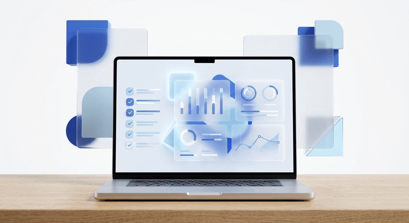
How do you use data visualization to keep users engaged?
Data visualization is the representation of information in a graphic format. For SaaS products, this often means turning raw logs into actionable charts. We find that users are more likely to log in daily if they have a dashboard that provides immediate insights. These visuals create a reason for the user to keep your app open in a browser tab at all times.
We recommend focusing on clarity over complexity. A common mistake is trying to show too much data at once. Instead, use a hierarchy where the most important numbers are large and bold. Provide the ability to click into details if the user needs more information. This drill-down approach keeps the main interface clean while still providing depth for power users. When users can see the impact of their work through your visuals, they feel a stronger connection to the product.
Stickiness is a metric that measures how often users return to your product. High-quality data visualization is one of the strongest drivers of stickiness. If your charts are easy to share or export, your product becomes a part of the user's internal reporting workflow. Once your tool is embedded in a company's weekly meeting or report, the cost of switching to a competitor becomes much higher. We suggest using interactive elements in your charts to allow users to manipulate the data in real-time. This level of interaction turns a static report into a functional tool.
Why should you prioritize mobile responsiveness for B2B SaaS?
Mobile responsiveness is the ability of a website or app to adapt to the screen size it is being viewed on. While most B2B work happens on a desktop, many users check their metrics or approve requests on their phones. If your UI breaks on a mobile device, you lose an opportunity to keep the user engaged outside of working hours. We suggest a mobile-first approach for critical notification and reporting screens.
In our experience, founders often overlook the mobile experience for B2B tools. However, being available in the pocket of your customer builds a different kind of retention. It makes your software feel like a constant utility rather than a desk-bound chore. We recommend simplifying the mobile UI to focus on one single action per screen. This focus prevents the frustration that often comes with trying to use complex desktop software on a small touch screen.
Speed is even more important on mobile devices. Users on the go often have slower internet connections and less patience. If your mobile app takes more than three seconds to load, you are likely to lose that user for the day. By optimizing your assets and using efficient design patterns, you can provide a fast experience that keeps users connected to your product. This accessibility is a key part of the top ways to boost saas retention ux in a mobile-centric world.
How can you measure the success of your UX changes?
Measuring the success of UX changes requires a mix of quantitative and qualitative data. Quantitative data tells you what is happening, such as a drop in churn or an increase in daily active users. Qualitative data tells you why it is happening, often through user interviews or session recordings. We recommend using tools like Hotjar or Mixpanel to track how users interact with your new designs.
A key metric to watch is the Time to Value (TTV). TTV is the amount of time it takes for a new customer to realize value from your product. If your UX changes decrease the TTV, your retention will almost certainly increase. We also suggest tracking the completion rate of your onboarding flow. If users are getting stuck at a specific step, that is a clear signal that the visual communication needs improvement.
We find that regular A/B testing is essential for long-term growth. An A/B test is a method of comparing two versions of a webpage or app against each other to determine which one performs better. By testing small changes to your UI, you can make data-driven decisions that lead to compound gains in retention. Don't rely on gut feelings; let the user behavior guide your design roadmap. This scientific approach to design ensures that you are always moving toward a more retentive product.
What are the next steps for your SaaS product design?
The top ways to boost saas retention ux all lead back to one goal: making your product indispensable to your users. Whether you are building a new onboarding flow or launching a design system, every pixel should serve the purpose of keeping your customers engaged. We suggest starting with a single friction point in your current product and applying the principles of minimalism and clarity to fix it.
Product design is not a one-time project. It is a continuous effort to stay aligned with your users' evolving needs. As we move through 2026, the SaaS market will only become more competitive. The companies that survive will be those that prioritize the user experience as a core competitive advantage. We find that founders who invest in high-quality visuals and intuitive workflows see the highest returns on their marketing spend. By reducing churn through better UX, you create a stable platform for scaling your business. Take a hard look at your current dashboard today. Ask yourself if it helps your user succeed or if it gets in their way. The answer to that question will determine your retention rate for the coming year.
Final takeaways for your team:
Audit your onboarding for cognitive load.
Use progressive disclosure to hide complex features.
Implement success metrics directly in the UI.
Maintain a design system for visual consistency.
Measure TTV and iterate based on user data.


